Form Builder
| Component | Type | Description | |
|---|---|---|---|
 | Form Builder | ▶️ trigger | Build online forms to collect data |
There is a lot of documentation for the form builder - be sure to use the navigation menu on the right to find what you need. If you can't find the answer you are looking for, contact us via the live chat or via support@workflow86.com.
Configuring questions
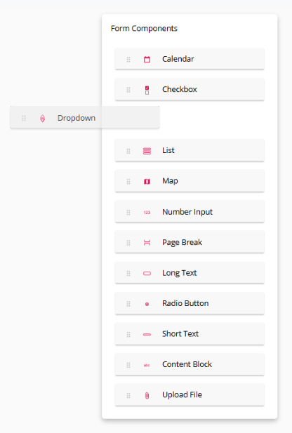
Inserting a question
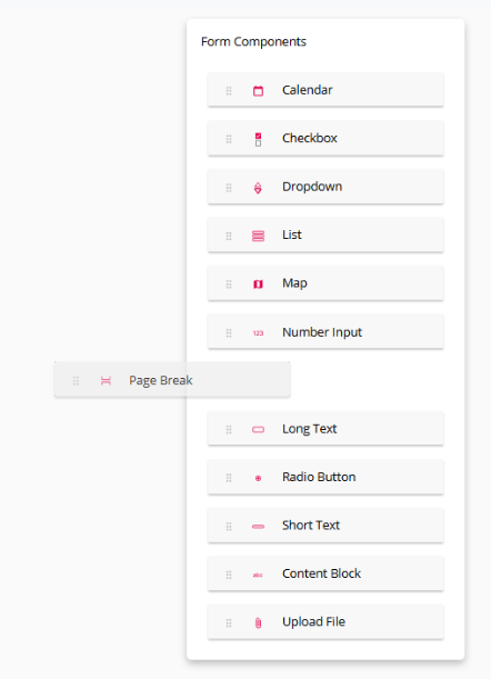
To insert a question, simply click and drag the question type you want to insert and drop it into form.
Editing a question
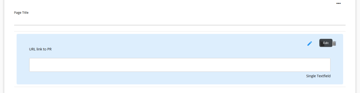
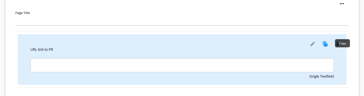
To edit a question, hover over the question and click the edit button on the right hand side of the question.
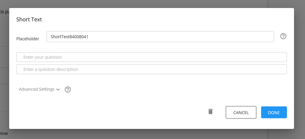
This will open up the configuration dialog for that question.
Deleting a question
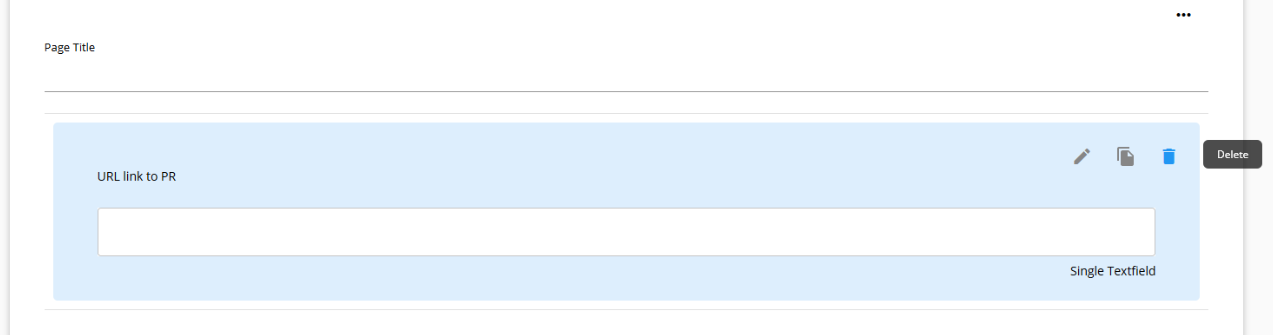
To delete a question, hover over the question and click the delete button on the right hand side of the question.
Duplicating a question
To duplicate a question, hover over the question and click the copy button on the right hand side of the question.
Duplicating a question creates an exact copy of everything in that question, including any advanced settings configurations, except the placeholder. A duplicated question is always created with a new placeholder.
Configuring pages
To create a new page in the form, drag and drop the "Page Break" from the questions menu into the desired location.
Deleting pages
To delete a page, click the page settings button on the top right
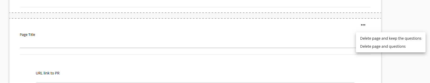
When deleting a page, you can choose to either delete all the questions on that page, or delete the page but move all the questions to the preview page.
Basic question settings
The form builder allows you to create an online form to collect information from users. It acts as one of the trigger points for a workflow, with a workflow starting when a form is submitted.
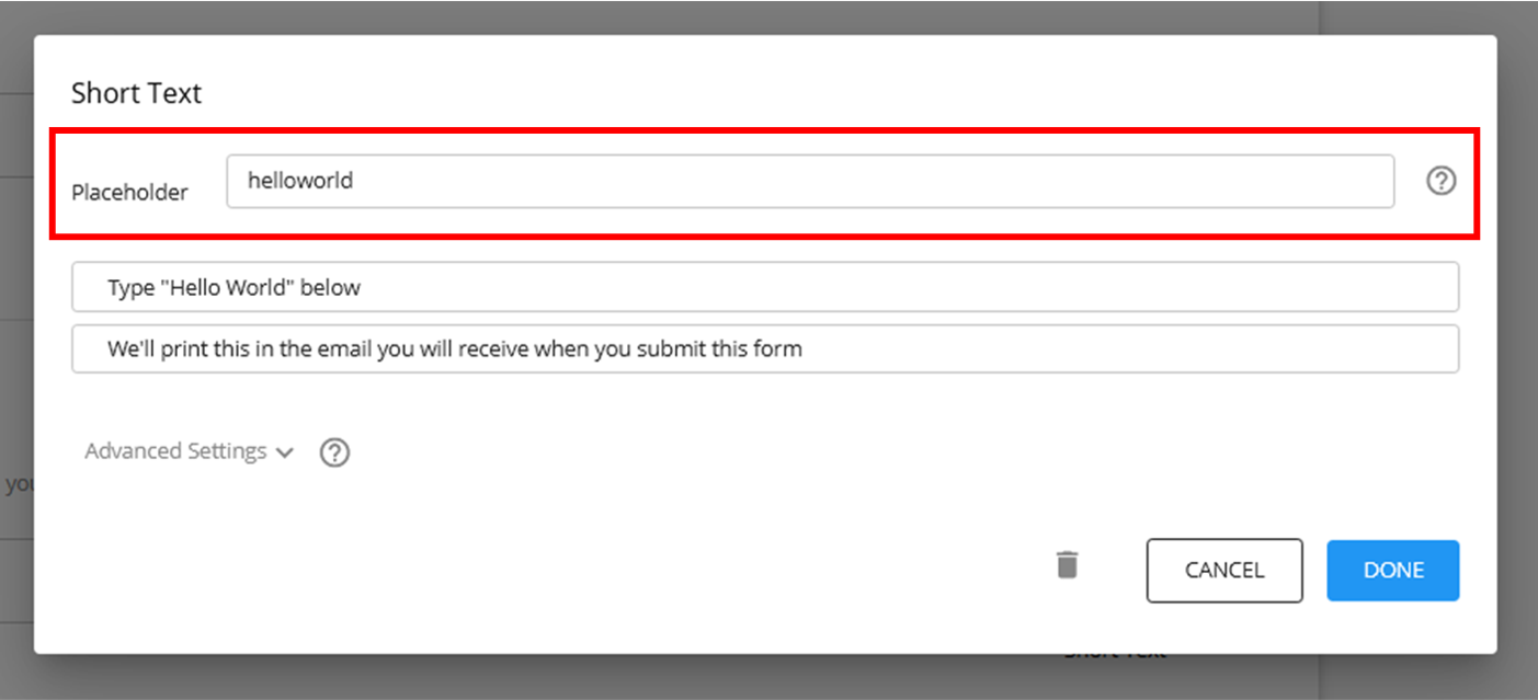
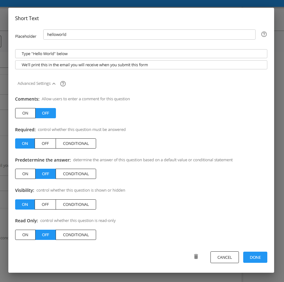
Placeholder (previously "Key")
The placeholder is how the answer to the question will be represented as a variable.
All questions are auto-assigned a placeholder value when they are first inserted into the form (e.g."ShortText84008041"), but you can change this to whatever term you want. You can only use letters and numbers in your placeholders.
Question text
The text entered here is displayed as the question text for that question.
Description
The description appears below the question text. You can use this to provide further details about the question.
Validation
Validation is available for the following question types: short text, long text, number. Using validation, you can control the value of the answer provided by the user, and prevent them from submitting the form if the answer is not valid.
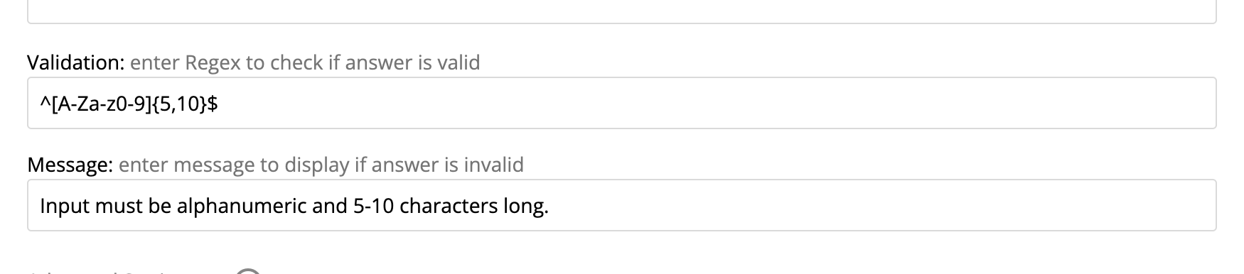
Regex validation
Short text and long text questions support regex validation. This allows you to specify a regular expression that the answer must match. If the answer does not match the regex, the user will be shown an error message and the form will not be submitted.
Number validation
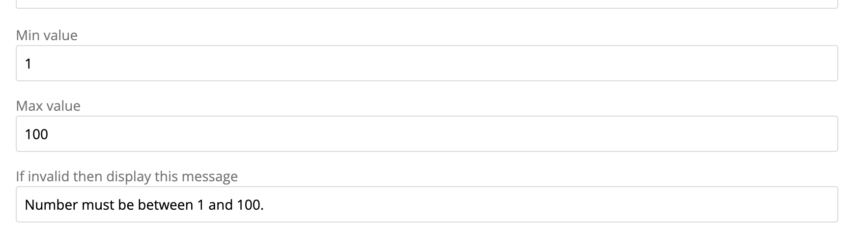
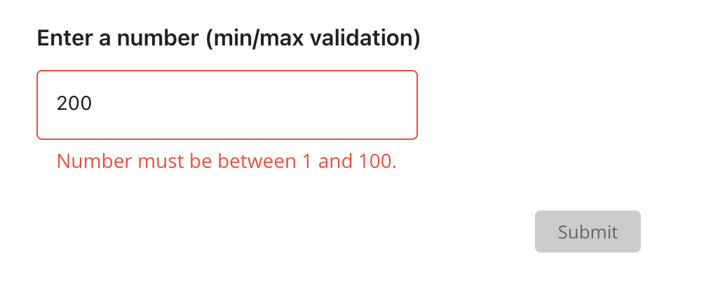
Number questions support number validation. This allows you to specify a minimum and maximum value that the answer must be between. If the answer is not between the specified values, the user will be shown an error message and the form will not be submitted.
Error message
You can set a custom error message for each validation rule. If no error message is set, a default message will be shown.
Advanced Settings
Each question has advanced setting which allow you to control how the user interacts with the question and how it behaves in response to certain events. In these settings, you can control the visibility of the question, whether it must be answered or not, whether the question is read-only, prefill the answer to the question based on other questions or inputs, and add a comment field to the question.
Visibility
This field allows you to control whether and when a question is visible or hidden to the user.
On
By default, all questions have their visibility set to on.
Off
This renders the question hidden.
If a question is hidden and is also required, this will prevent the user from progressing further in a form.
Conditional
This allows you to set up a conditional logic statement to make the question visible or hidden. For example, you can set a question to be visible based on the answer to another question.
Required
This field toggles whether the question must be answered by the user.
Off (default)
By default, all questions are created with the required field switched off. This means the user does not have to answer the question before continuing or submitting the form.
On
When switched on, the user will be prevented from continuing onto the next page or submitting the form until an answer is entered.
Conditional
This allows you to set up a conditional logic statement to determine whether the question must be answered or does not need to be answered. You can reference the answers to other questions and evaluate them to turn the required status on or off e.g. If the answer to Question 1is “Yes” then Question 2 must be answered, otherwise it does not need to be answered.
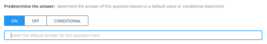
Prefill the answer
This feature allows you to prefill the answer to a question using a set value or based on a conditional statement.
Off (default)
This is the default state for this feature. It means there is no prefilled answer to the question, whatever the user selects or types is the answer.
On
When turned on, a small textbox will appear. You can type in the prefilled answer you want to set for this question. When the user views the question, they will see this answer already typed in or selected.
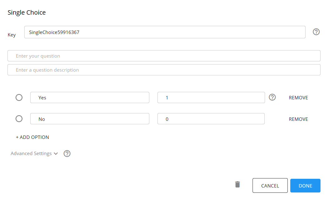
To configure a prefilled answer for a select-type question (such as a single choice, dropdown or checkbox) where you have set an answer choice and an answer value, you will need to type in the answer value for a question option (and NOT the answer choice).
If the answer to a select-type question has a answer choice “Option A” and a answer value of “A”, to have this be the prefilled answer, you will type "A" amd NOT “Option A” into the text field.
Note that the user can edit and change this prefilled answer. If you do not want them to be able to change the prefilled answer, set read-only state of the question to ON.
Conditional
This setting allows you to create a conditional logic statement to determine the answer to the question. You can use the answers to previous questions to set up this conditional logic state e.g. If the answer to Question 1 is “A” then the answer to this question will be “B”
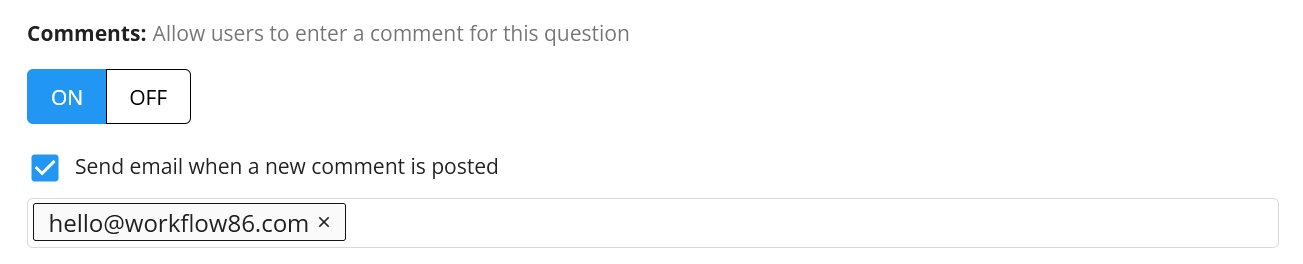
Comments
You can allow users to add comments to any question field by turning on the comments field. This will a comments dialog to that question where different users can post comments in a chat-like interface.
Off (default)
By default, the comment feature is turned off.
On
When the comment feature is turned on, a textbox will appear beneath a question where the user can type in comments. If a user is logged in when they post a comment, their username will appear at the top. If a user is not logged in or someone is commenting on a form without a Workflow86 account, they will be provided with an alias.
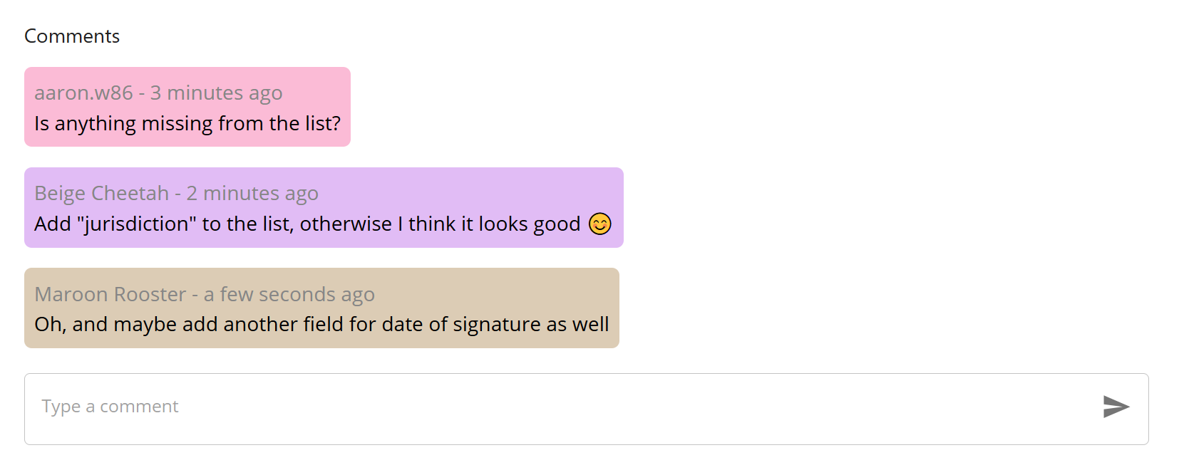
The comment can be used to provide additional contextual information about an answer to a question (e.g. "This was my answer, but here is why I answered it this way") and to allow collaboration between users when answering a question or a form (e.g. "How should I answer this?")
All comments are exported as ${question_placeholder.comment} and in the following format:
User_A commented "comment that they typed out will be printed here" at 2022-11-01 12:00PM User_B commented "another comment here" at 2022-11-01 12:05PM User_C commented "yet another comment here" at 2022-11-01 12:10PM
Get notified via email when comment posted
To get or send an email notification when a comment is posted, turn on this field and then type in the emails you want the notifications to be sent to. In the Assign Task, the email field can be a placeholder as well.
Read Only
This setting allows you to make a question read-only, preventing the user from interacting with the question. This feature is typically combined with the prefill answer feature.
Off (default)
The default state for this feature is off, meaning that the user can interact with the question, type in or select an answer.
On
When turned on, the user will not be able to type or select an answer to the question. Note that you should exercise caution in turning on the read only state with the required state also on - this may result in the answer being prevented from progressing or submitting a form and being unable to answer the question that is blocking them.
Conditional
This allows you to construct a conditional logic statement to control whether the read only state is on or off.
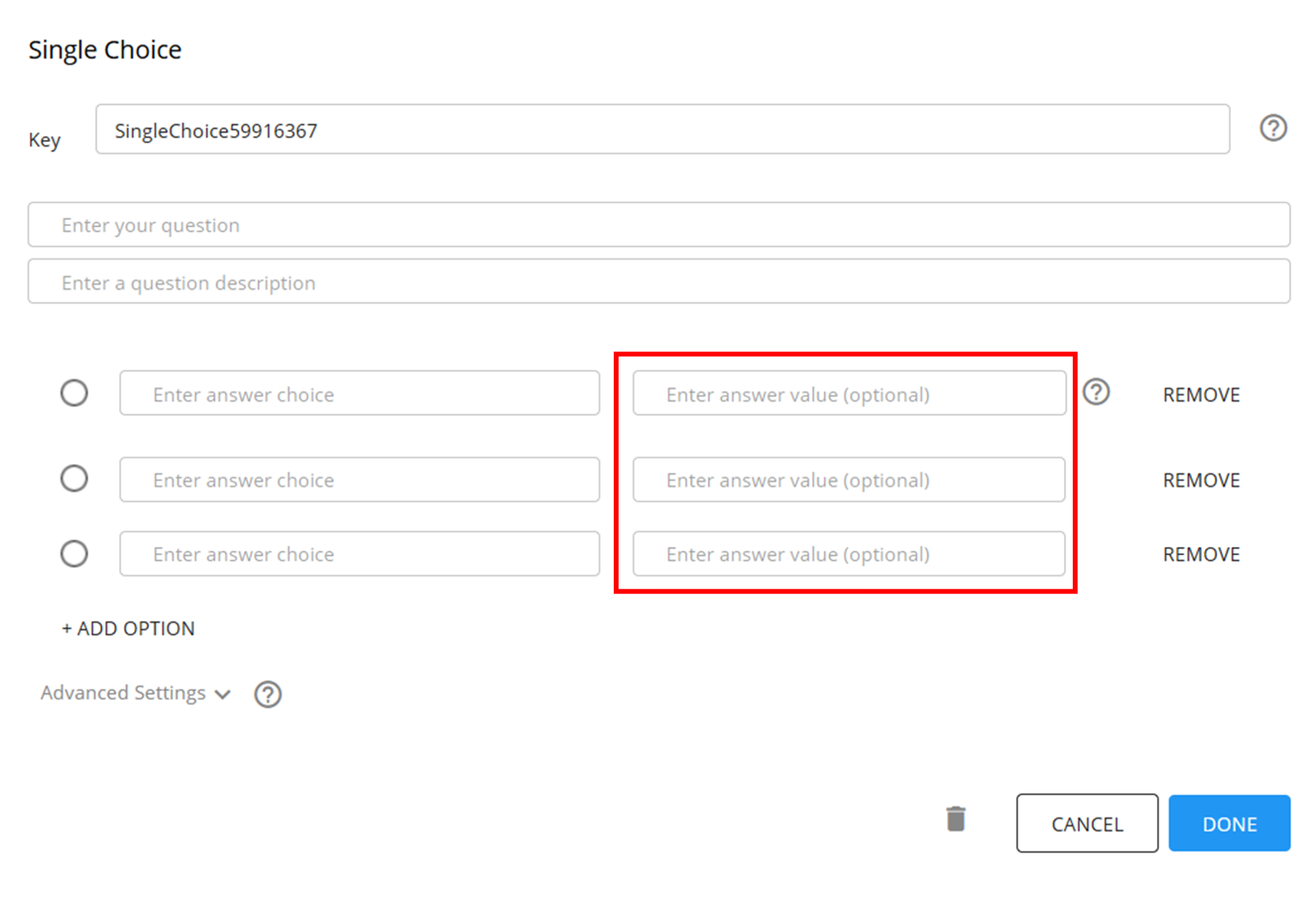
Answer choices and answer values
Select type questions (single choice, dropdown, checkbox) allow you to configure an answer choice and a separate answer value.
The answer choice is what is displayed to the user in the form.
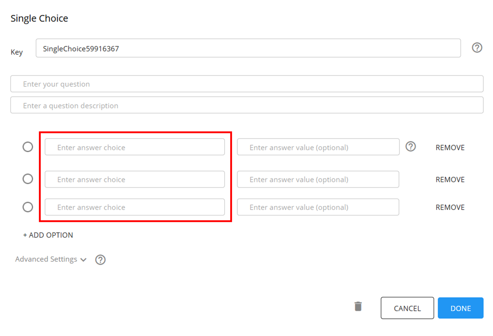
The answer value is an optional field that allows you to set a separate value to be outputted when the user selects an answer choice.
For example, the answer choice displayed to the user might be "Yes" and "No", but the value that you would like to be outputted into the workflow is 1 and 0.
The answer value is an optional field, so you can leave it blank. If it is left blank, the output of the question will be the answer choice.
In any conditional logic statements or in the prefill answer feature, it is the answer value (and NOT the answer choice) that needs to be used.
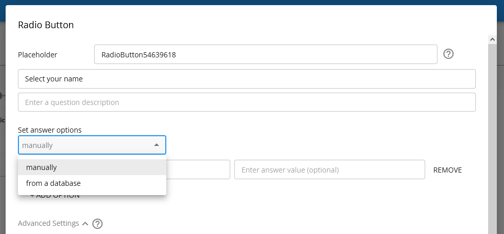
Get answer values from database
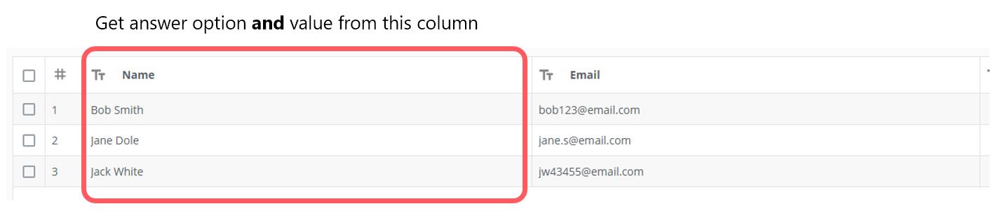
For Select Type questions, you can set the answer options via the column of a database. For example, say you have a database with two columns like this:
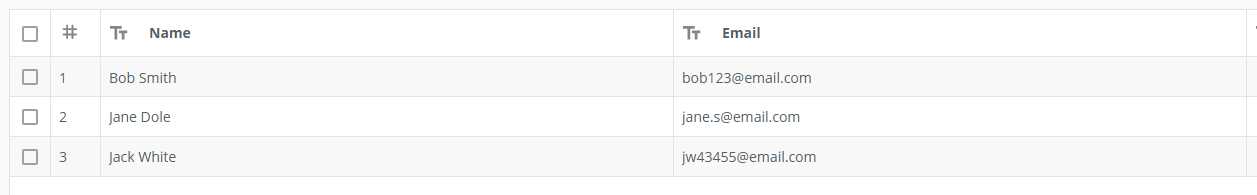
You want to create a question where the answer options are taken directly from the Name column in the database like this:

You can do this by choosing the set answer options "from a database":
Then select the database, the column that will contain the answer options and the column that will contain the answer values. This enables you to display one column as the answer options, but have the value of returned (i.e. the value of the placeholder) actually be from another column.

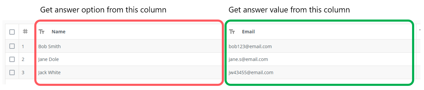
Get answer option and answer value from same column
If we want the answer options to be the names and the value returned to also be the name, we select the name column for both. In this case, when the user selects Bob Smith, it will return Bob Smith.
Get answer option and answer value from different columns
However, you can also have the answer return the value from the email column while keeping the answer options that the user sees and selects as the name. In this case, when the user selects Bob Smith, the value of the placeholder for this question will be "bob123@email.com"

You can use this feature to, for example, expose a certain column for the user to select but return the Record ID for that column (which can then be passed to the Update Database Record component)
Note that as new records are added to the database, they will also appear as additional options for this question as well:

Previewing a form
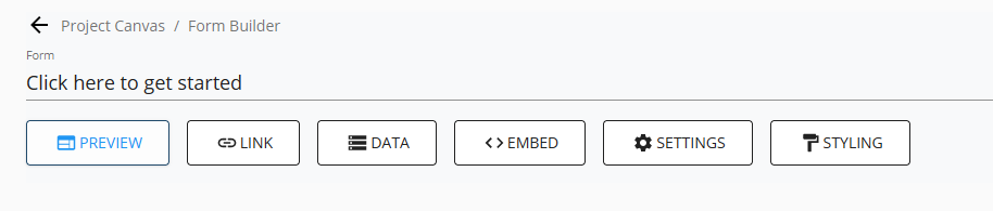
To preview a form you are building, press the "Preview" button in the toolbar above your form.
Before the form preview is opened, the current form will be saved, and the form preview will then open in a new tab.
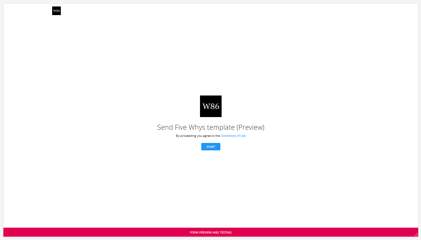
The form preview has all the functionality of a normal form, with the exception that it cannot be saved or submitted. You can use the form preview to see the layout of the form you have built and test any advanced functionality you have configured such as visibility and prefilled answers.
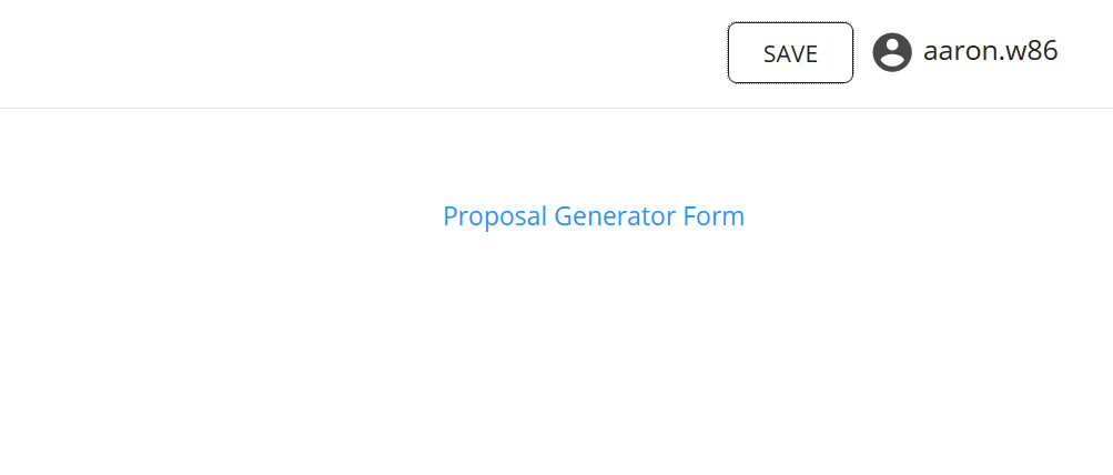
Saving a form session
You can allow users to save their progress on a form and resume that form at any time by turning on the save functionality in the form settings
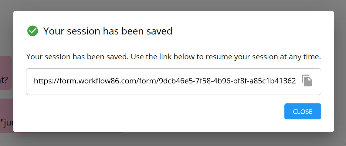
When completing a form, you can save your progress and resume the form at any time by clicking the save button in the top right hand corner.
When you click save, a small dialog will appear with a link you can use to resume that form session at any time.
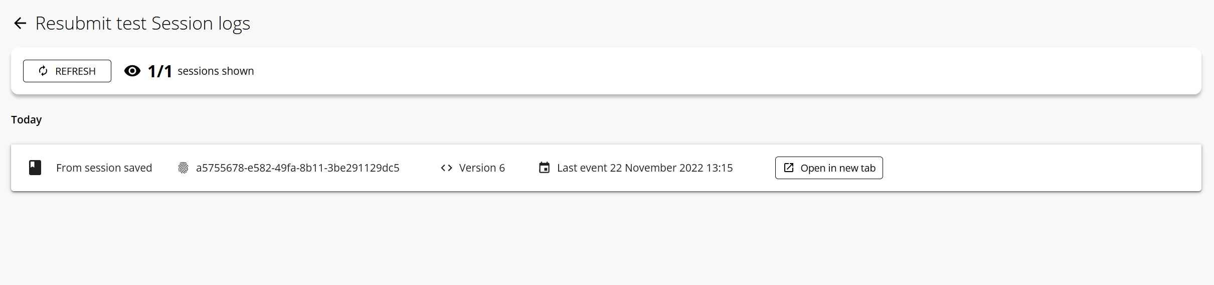
Viewing saved form sessions
If a form session has been saved but not submitted, it can be found listed in the session logs. Once a form session has been submitted, it will appear as part of a workflow session in the normal session logs.
Redirect form after it is submitted
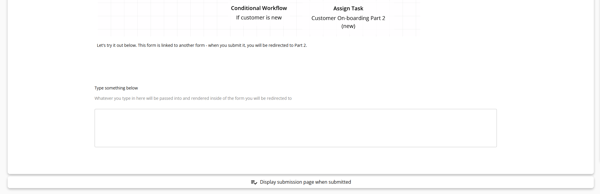
When a form is submitted, you can set it to automatically redirect to another form in the same web session. This means once the user submits the form, they will be automatically redirected to the next form without having to manually retrieve a link to the second form from their email or My Tasks page.
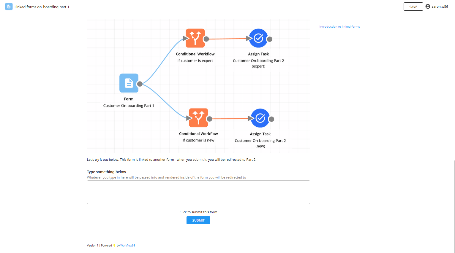
Take the following workflow as an example:
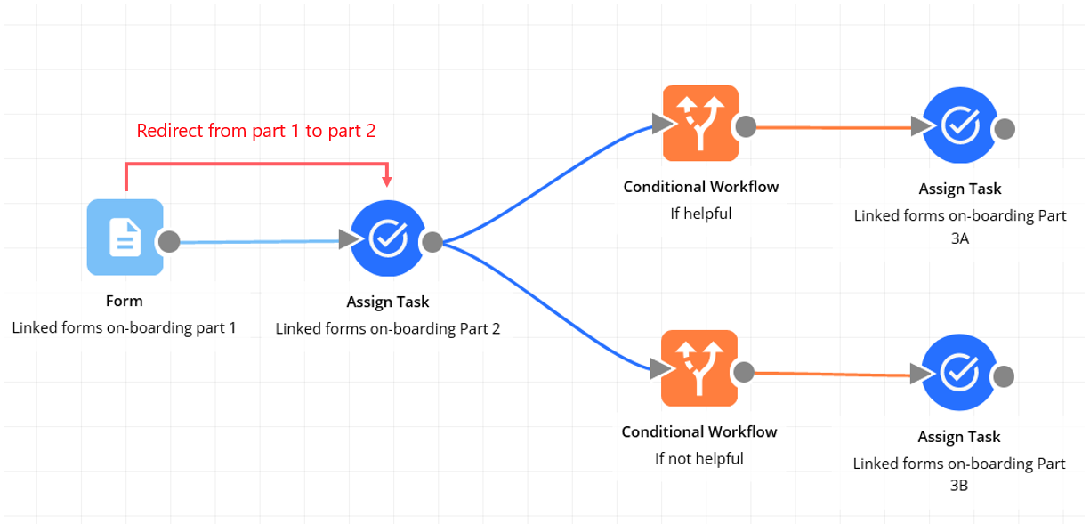
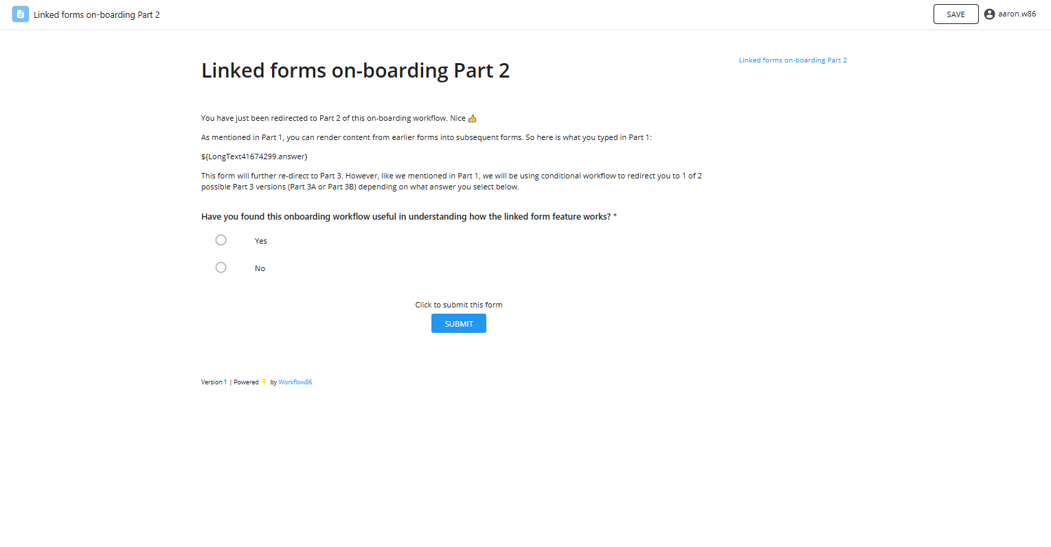
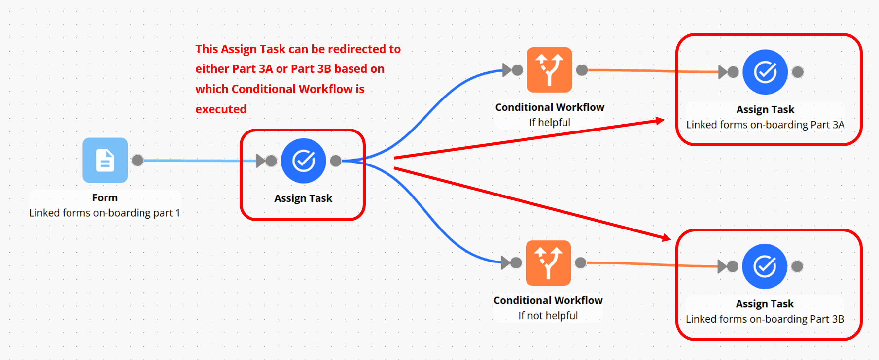
Once the user has submitted "Linked forms on-boarding part 1", we want to automatically redirect them to the "Linked forms on-boarding part 2". We can achieve this by linking these two components together.
Redirecting to a Form Section or Assign Task
Click the bar at the bottom of the form, or click Form Settings button to bring up the form settings:
For the option which sets what happens after the form is submitted, select "redirect to another page":
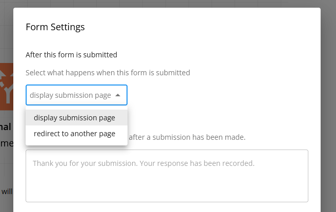
Then select the component(s) that you want to redirect to after the form is submitted.
Once this has been set, the form will now redirect when it is submitted:
You can select multiple possible destination forms/tasks for redirection
Note that if you have multiple possible forms, tasks or form sections that the user can be redirected to, select all possible options e.g. if Form A can redirect to Form B, C or D, then select Forms B, C and D in the redirect options. When submitted, the first of the possible form redirects to execute will be the form that the user is redirected to.
What happens on redirect?
Once the first form has been submitted:
A loading screen will be displayed:
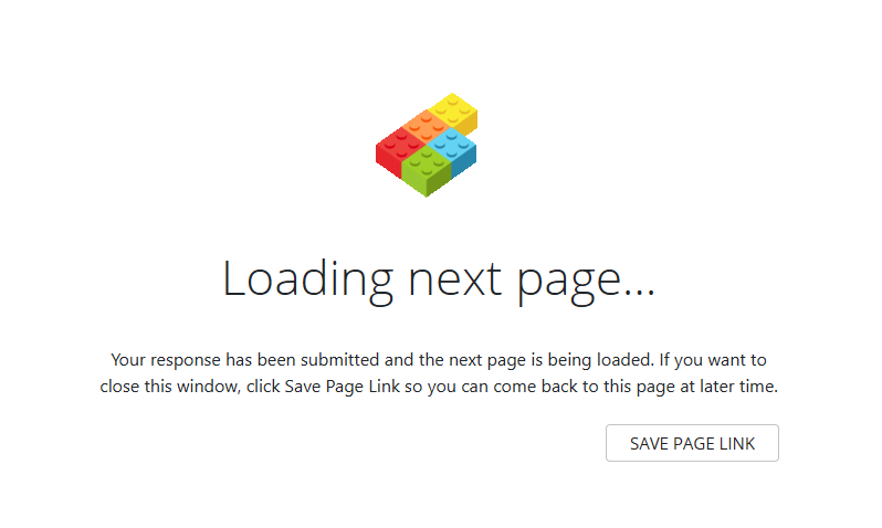
After which the user will then be redirected to the next form once that linked form has been generated:
Combining linked forms with conditional paths
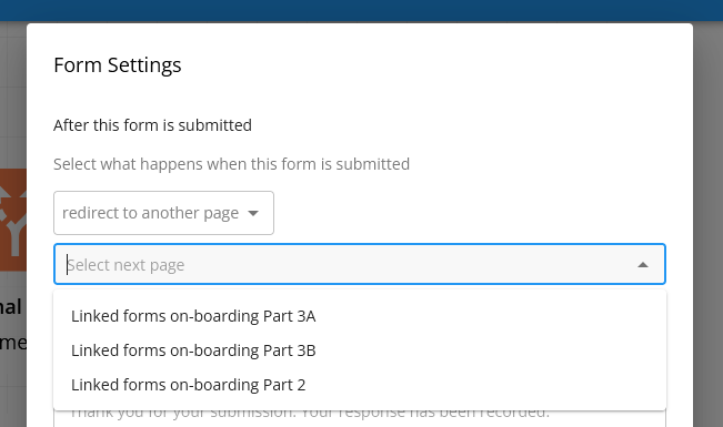
In the example below, we want to set the "Linked forms on-boarding part 2" to redirect to one of two possible options: "Linked forms on-boarding part 3A" or "Linked forms on-boarding part 3B". Which form it will be redirected to will depend on which path gets executed based on the Conditional Path component. In this case, there are multiple possible destinations for the redirection.
To set this, we simply select both "Linked forms on-boarding part 3A" and "Linked forms on-boarding part 3B" in the form settings:
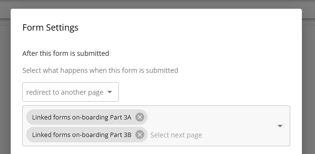
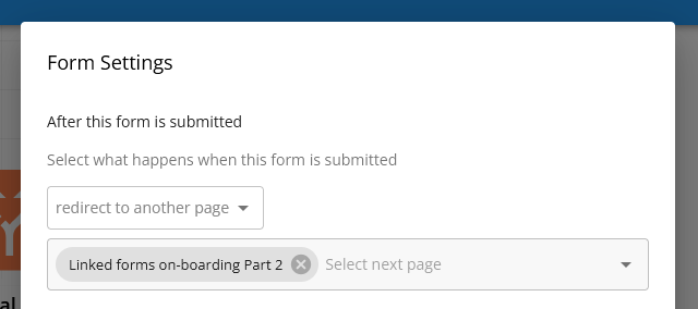
The form will then redirect to whichever of the two selected forms gets generated when the form runs.
Always make sure to select all possible destinations when setting the redirection.
Redirecting to an external URL
You can also redirect users to an external URL after they submit a form. This is useful when you want to:
- Send users to a thank you page on your website
- Redirect to a payment portal
- Direct users to additional resources or documentation
- Integrate with external systems or applications
To set up an external URL redirect:
- Click the bar at the bottom of the form, or click the Settings button to open the form settings
- For the option which sets what happens after the form is submitted, select redirect to external URL
- Enter the full URL (including
https://) that you want to redirect users to
When the form is submitted, the user will see a brief "Redirecting..." message with a countdown, showing the destination URL. After a few seconds, they will be automatically redirected to the specified external URL.
The external URL redirect takes precedence over internal form redirects. If you want to redirect to another form within your workflow, use the "redirect to another form" option instead.
Make sure to enter the complete URL including the protocol (e.g., https://example.com/thank-you rather than just example.com/thank-you).
Form metadata
In addition to the placeholders from any questions, all Forms also export metadata placeholders including:
- projectSessionID: the workflow session ID that is created when the form is submitted
- formSessionID: the form session ID that contains the data entered into and saved to the form
- formSubmittedDate: a timestamp of when the form was submitted
- formSessionURL: a URL link to the form that was submitted
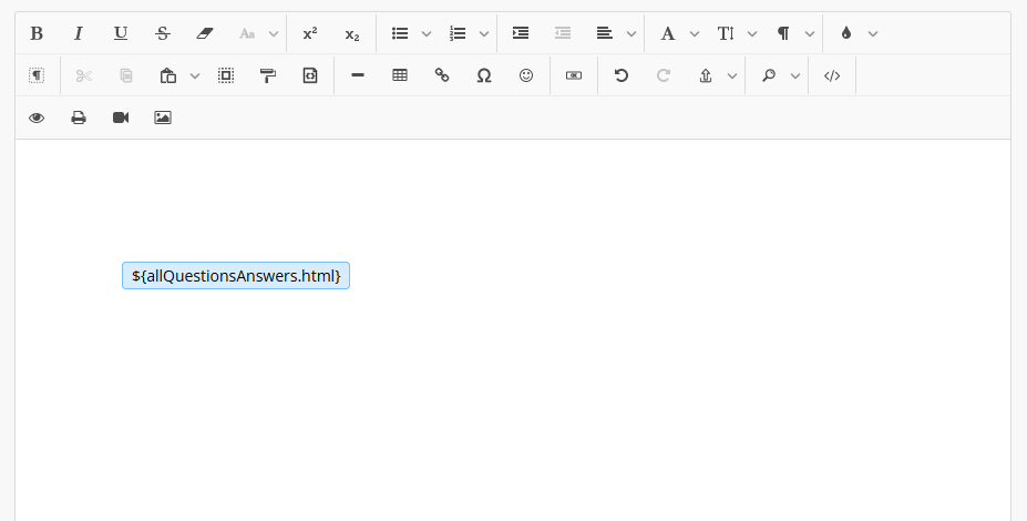
- allQuestionsAnswers.html: a black of HTML that prints all questions and answers in the form

Printing all questions and answers from a form
The ${allQuestionsAnswers.html} placeholder allows you to easily print all questions and answers from a submitted form in any component that can handle HTML inputs (such as the email body, content block, document editor).
Components that handlet HTML inputs
You can insert the ${allQuestionsAnswers.html} into the following components:
- Document editor
- Email body in the Email component
- Task description, reminder email body in the Assign Task
- Content block in the Form, Form Section and Assign Task
If the ${allQuestionsAnswers.html} is used in a component not designed to handle html, it will still print all the questions and answers but these will contant HTML formatting like this:
<p><span><p><span style="white-space:pre-wrap;"><strong>Question: Calendar4867189</strong><br><br>Answer: 1658309640000</span></p><br><p><span style="white-space:pre-wrap;"><strong>Question: Checkbox32085397</strong><br><br>Answer: Value</span></p><br><p><span style="white-space:pre-wrap;"><strong>Question: List33163839</strong><br><br>Answer: [ asdsadsad]</span></p><br><p><span style="white-space:pre-wrap;"><strong>Question: LongText58495921</strong><br><br>Answer: asdsadsadsa</span></p><br><p><span style="white-space:pre-wrap;"><strong>Question: NumberInput4335975</strong><br><br>Answer: 2132132131</span></p><br><p><span style="white-space:pre-wrap;"><strong>Question: RadioButton36253018</strong><br><br>Answer: Value A</span></p><br><p><span style="white-space:pre-wrap;"><strong>Question: ShortText80681055</strong><br><br>Answer: asdsadsa</span></p><br></span></p><p><span><span><p><span style="white-space:pre-wrap;"><strong>Question: Calendar4867189</strong><br><br>Answer: 1658309700000</span></p><br><p><span style="white-space:pre-wrap;"><strong>Question: Checkbox32085397</strong><br><br>Answer: Value</span></p><br><p><span style="white-space:pre-wrap;"><strong>Question: List33163839</strong><br><br>Answer: [ 111111111111111111]</span></p><br><p><span style="white-space:pre-wrap;"><strong>Question: LongText58495921</strong><br><br>Answer: 11111111111111111</span></p><br><p><span style="white-space:pre-wrap;"><strong>Question: NumberInput4335975</strong><br><br>Answer: 2222222222222</span></p><br><p><span style="white-space:pre-wrap;"><strong>Question: RadioButton36253018</strong><br><br>Answer: Value A</span></p><br><p><span style="white-space:pre-wrap;"><strong>Question: ShortText80681055</strong><br><br>Answer: 222222222222222222</span></p><br></span><br></span></p>
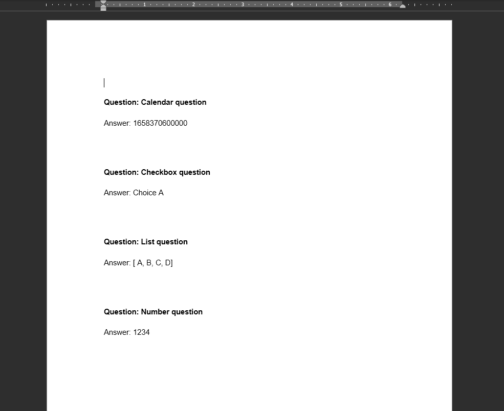
This placeholder prints a block of text with each question and answer from the form in the following format:
Question: {question text here}

Answer: {question answer here}
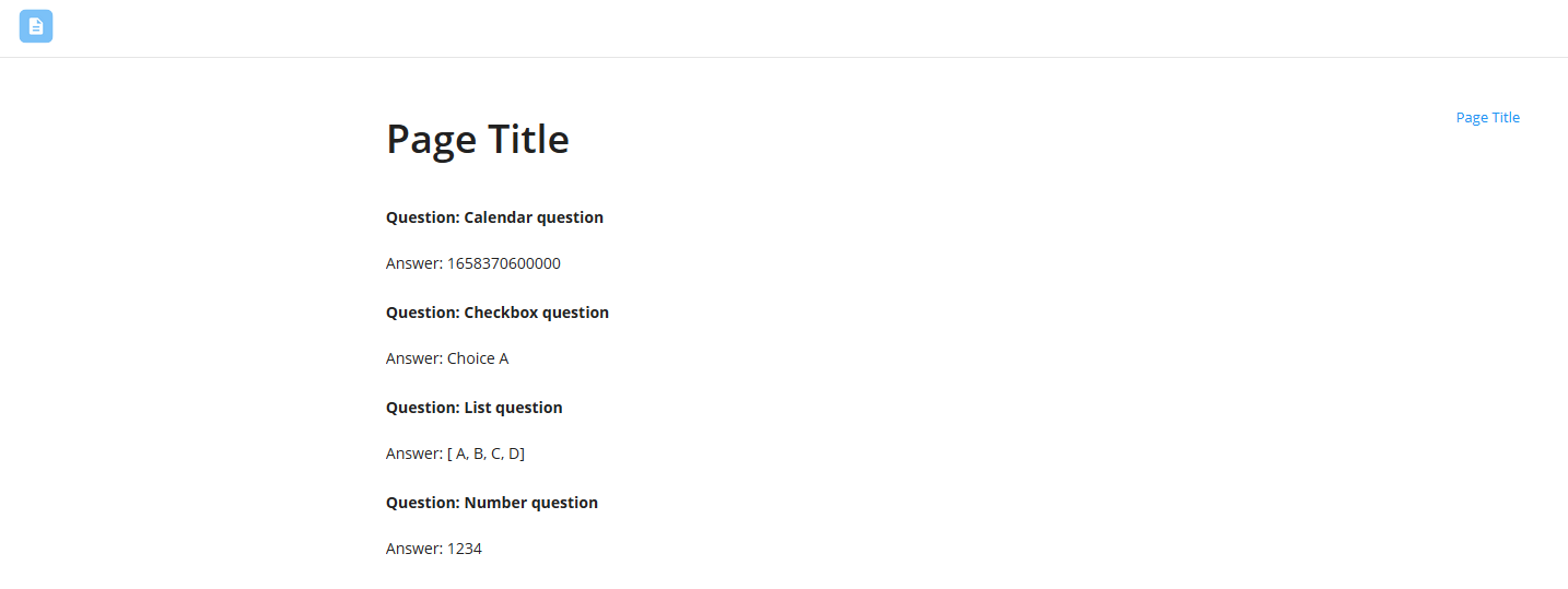
The result will look like this when printed into a document editor:
It can also be printed into the email body, as well as the content block of another form:
The question and answers from the following types of fields are currently not printed via the ${allQuestionsAnswers.html} method:
- E-signature
- Table
- Any questions which have not been answered
Component Settings
The component settings can be accessed by clicking the settings icon in the top right corner of the screen:
Adding prefixes to placeholders
If you have more than one Form trigger on your canvas, it is highly recommended that you distinguish between each form by setting a specific prefix to the placeholders. To set a prefix, click the settings button in the top right:
A dialog will appear - inside of the textfield, type in a component label. A component label can contain letters, numbers and underscores ("_") only.
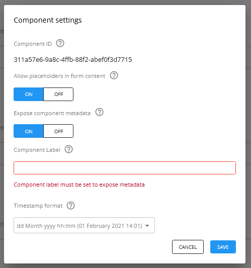
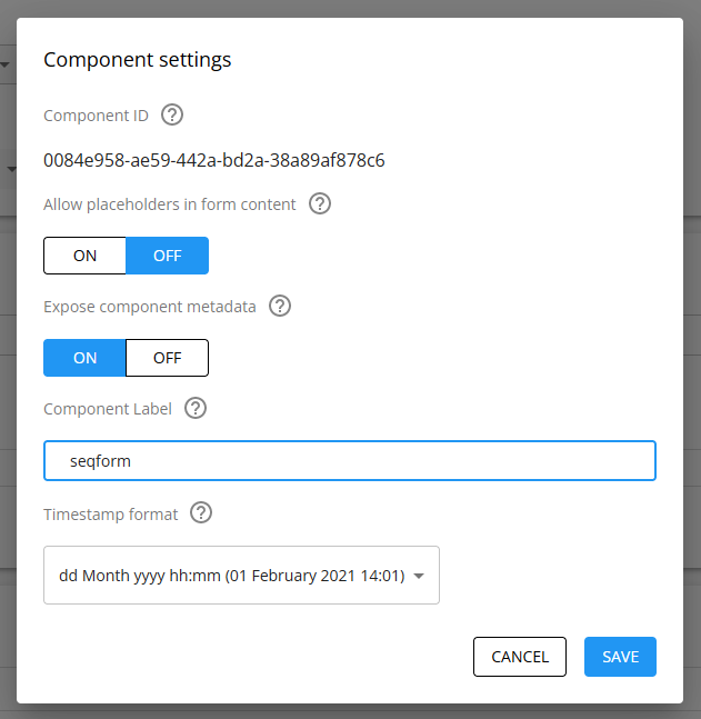
Setting a component placeholder will change all placeholder labels from this component i.e. ${placeholder} will not work, only ${component_label.placeholder} will work.
You will need to go through the workflow and update the old placeholders with the new placeholders containing the component label.
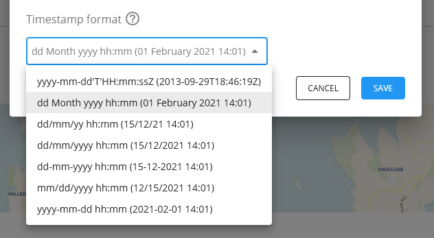
Changing format of the formSubmittedDate timestamp
You can change the format of the formSubmittedDate timestamp via the component settings.
Styling
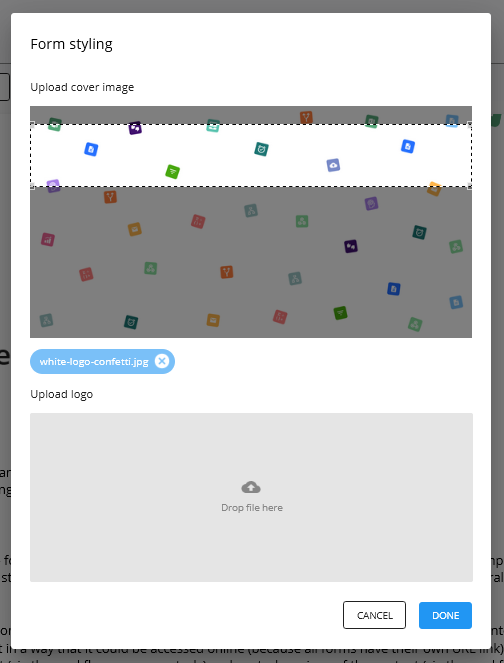
You can customize the styling of the form by setting a logo and a cover image.
Setting a cover image
To set a cover image that appears at the top of the form, click Styling, and then upload an image. You will need to crop the image displayed to the required aspect ratio (7:1).
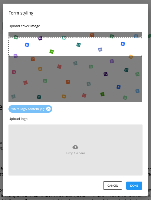
Click save to set the image as the cover image.
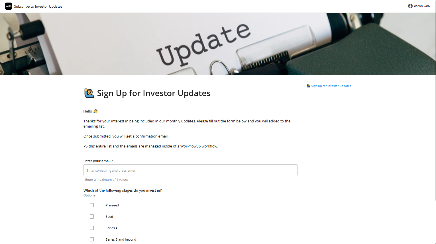
Setting a logo
The logo for a form is displayed in the top left of the top header bar.
To set the logo, click Styling and then upload your logo.
Form Settings
Access the form settings via the "Settings" button on top of the form builder.
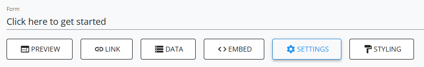
This will bring you to the form settings dialog
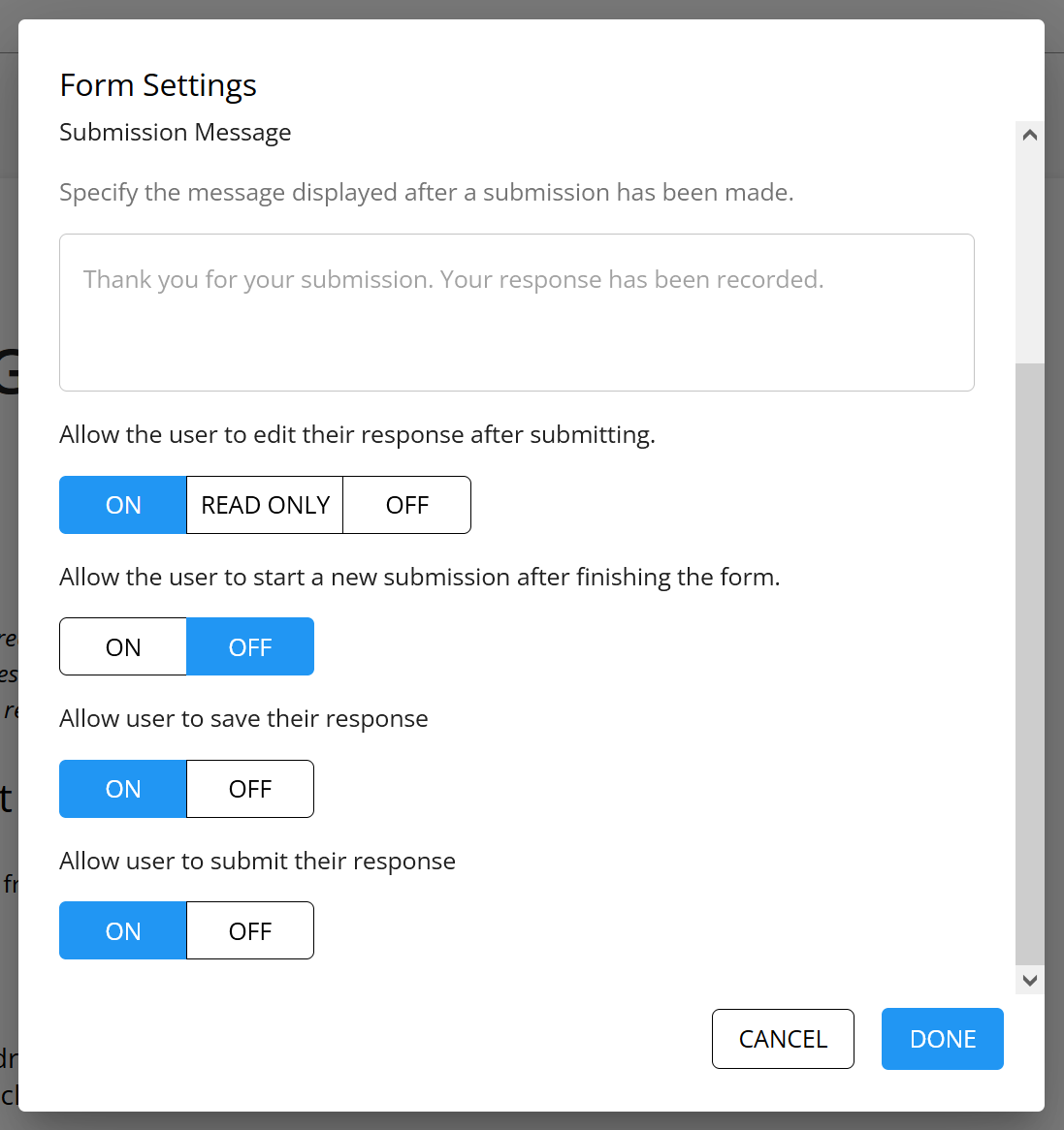
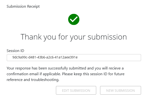
Submission message
You can specify the message that is displayed to the user once they have submitted a form here.
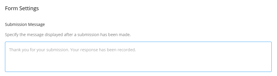
This message appears here, below the session ID
View, edit and resubmit forms after submitting
This setting controls what a user can do after a form is submitted and what happens if the user reloads the form session URL that is created when the form is saved and submitted.
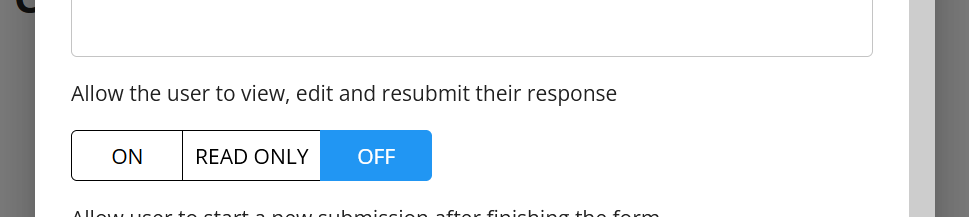
On
This setting allows the user to edit their response and resubmit it after they have submitted a response. Note that re-submitting an existing form session will trigger a new workflow session.
If a user attempts to reload the session, they will be able to reload the form session in a fully editable state and resubmit that form session.
Read only
This setting allows the user to view their response in a read only state. If a user reloads the submitted form session, they will not be able to resubmit their response, but can view their answers.
Off
This setting prevents the user from accessing their response after submission. An error page will be displayed if a user tries to reload their form session.
Submitted form sessions cannot be loaded
If a user attempts to reload the session, they will see the "This form cannot be loaded" page.
Allow the user to start a new submission after finishing the form
This controls whether you want to allow users to start a new submission after they have submitted a response.
On
When turned on, a "New submission" button will appear when a form has been submitted. Clicking this will create a new form session for the user to fill out.
Off
When turned off, the "New submission" will not appear after a form has been submitted.
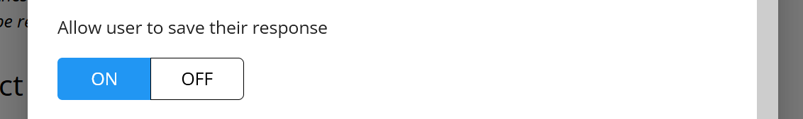
Allow user to save their response
This controls whether users can save their response and resume that form session at a later time.
On
When this is turned on, a save button will appear at the top right corner of the form navigation bar.
Off
When this is turn off, no save button will appear in the form. A form session will only be saved when it is submitted.
Auto-save forms
If the saving a form is turned on, you can also turn on the auto-save feature which will automatically save the form every 10 seconds.

When this is turned on, you will see an auto-save icon displays at the top right of your forms and tasks:

Allow user to submit their response
This setting controls whether the form can submitted. You may want to turn this off in cases where you are using the form to display static content and it does trigger any workflow.
Annotations
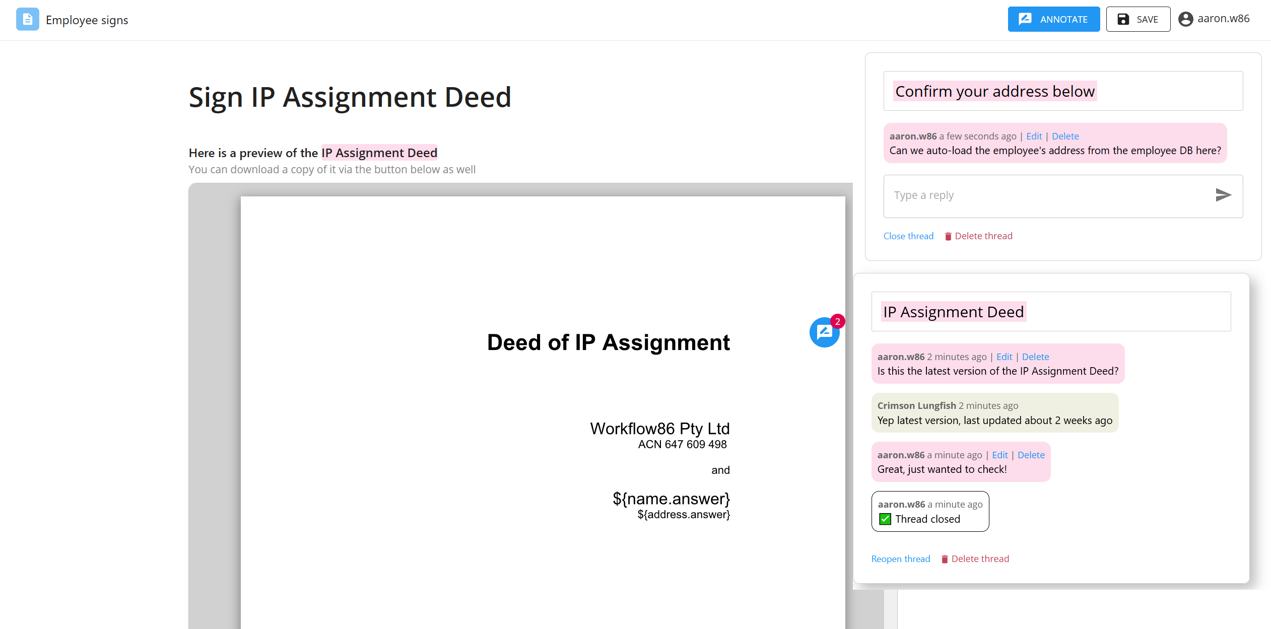
Annotations allow users to highlight parts of a form, and then add a comment connected to that highlighted content. This can be used to facilitate any discussion that may occur about the content of a form or task before it is submitted. For example:
- asking clarifying questions
- add more context to an answer
- commenting on changes that need to be made before submission
- collaborating with other users
Turn on annotations
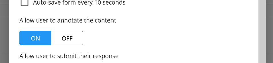
To enable users to add annotations, turn on the annotations option in the form settings:
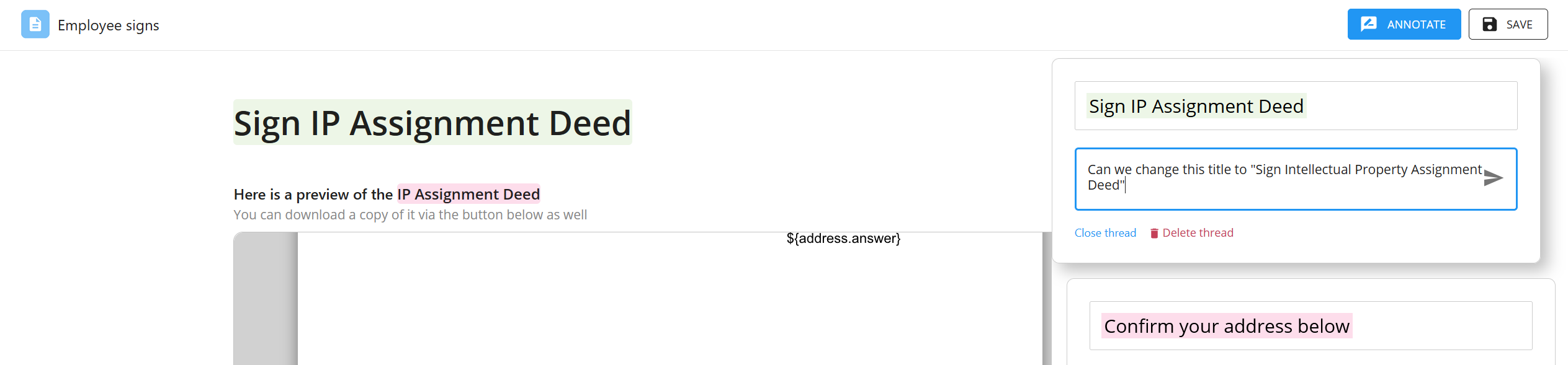
Annotating a form or task
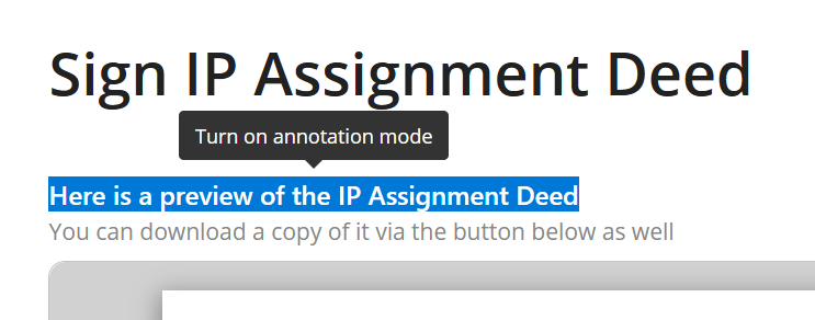
To annotate text inside of a form or task, the annotations mode needs to be turned on for that form session. This can be done by highlighting any text in a form or task and then clicking the popup that appears:
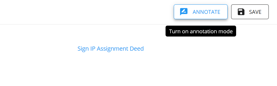
Annotations mode can also be turned on by clicking the annotations mode button at the top:
Question answers are locked and cannot be changed when annotation mode is ON
When the annotations mode is turned on in a form session, the answers to any question fields get locked. They cannot be changed or edited until the annotations mode is turned off.
Adding an annotation
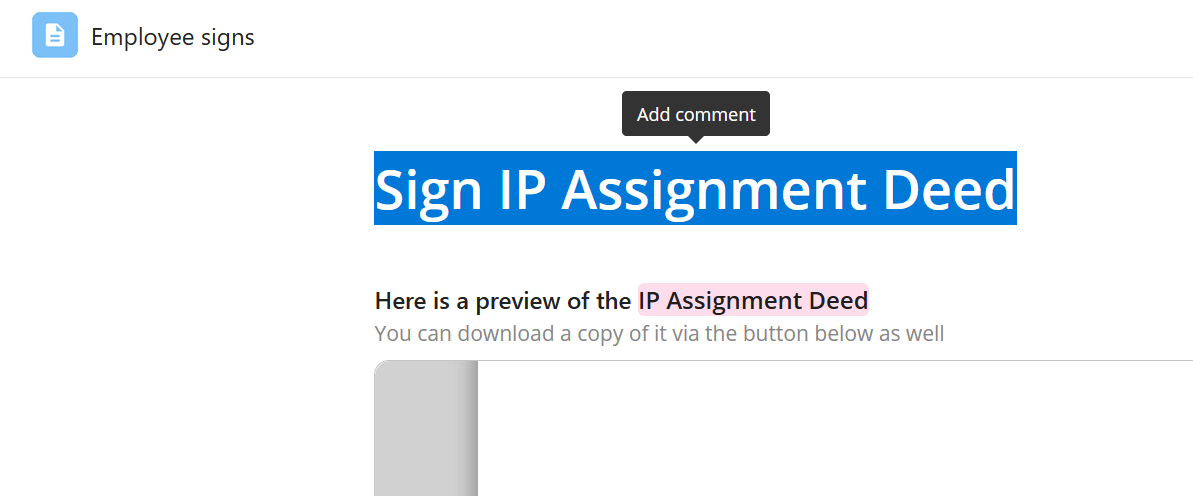
To add an annotation, highlight some text and then click the "Add comment" popup that appears:
This will create an annotation thread on the right-hand menu, where you can then add the first comment in the thread:
Once the thread has been created, other users can also input comments into that thread as well:
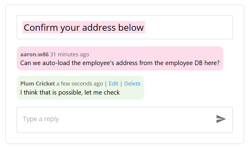
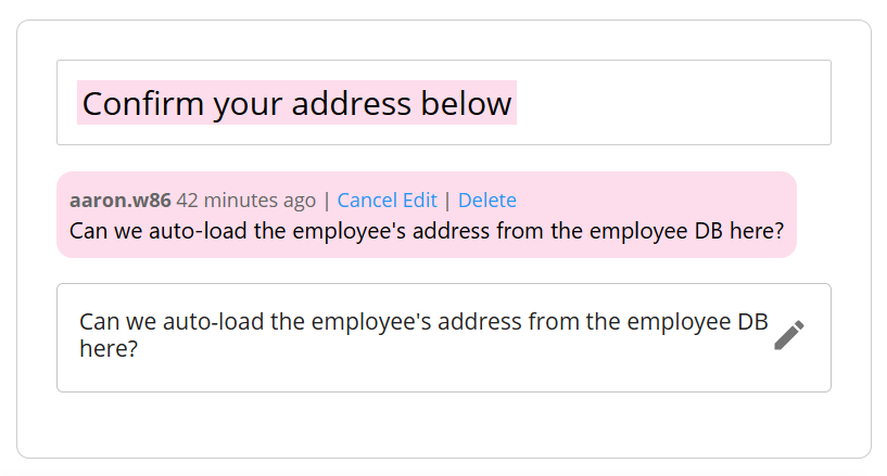
Editing and deleting comments in a thread
The author of a comment can edit or delete their comment in a thread by clicking the edit or delete buttons:
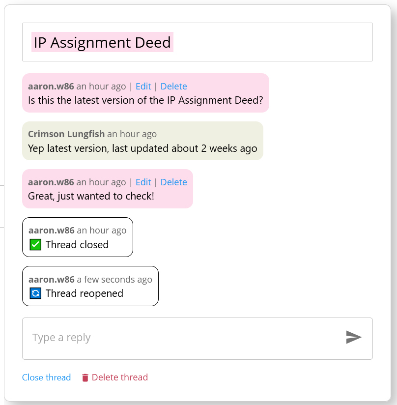
Closing and re-opening threads
Threads can be marked as closed or resolved by clicking the "close thread" button. This will post a message into the thread like this:
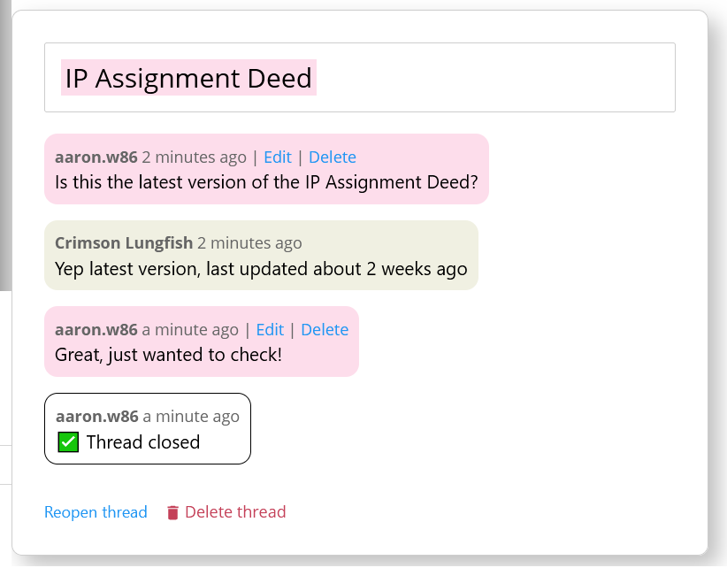
A thread can also be reopened by clicking the "Reopen thread" button:
Convert a Form
A Form can be converted into a Form Section or an Assign Task component. Doing this will turn the Form component into a Form Section or Assign Task while preserving all questions and form configurations.
To convert a Form Section, follow these steps here
Internal placeholders
In Forms, Form Sections and Assign Tasks, you can use internal placeholders to reference the answer of one question inside another question inside of the same form.
Read more about this feature 👉 here