Fields and Questions
The Form Builder and the Assign Task allow you to create interactive web forms using a variety of different fields and question types.
Short Text
The short text question captures short and single text answers.

Long Text
The long textfield works like the short textfield, but provides a larger textfield to accommodate longer text. Use this to provide the user more space to enter in longer text answers which may contain paragraphs

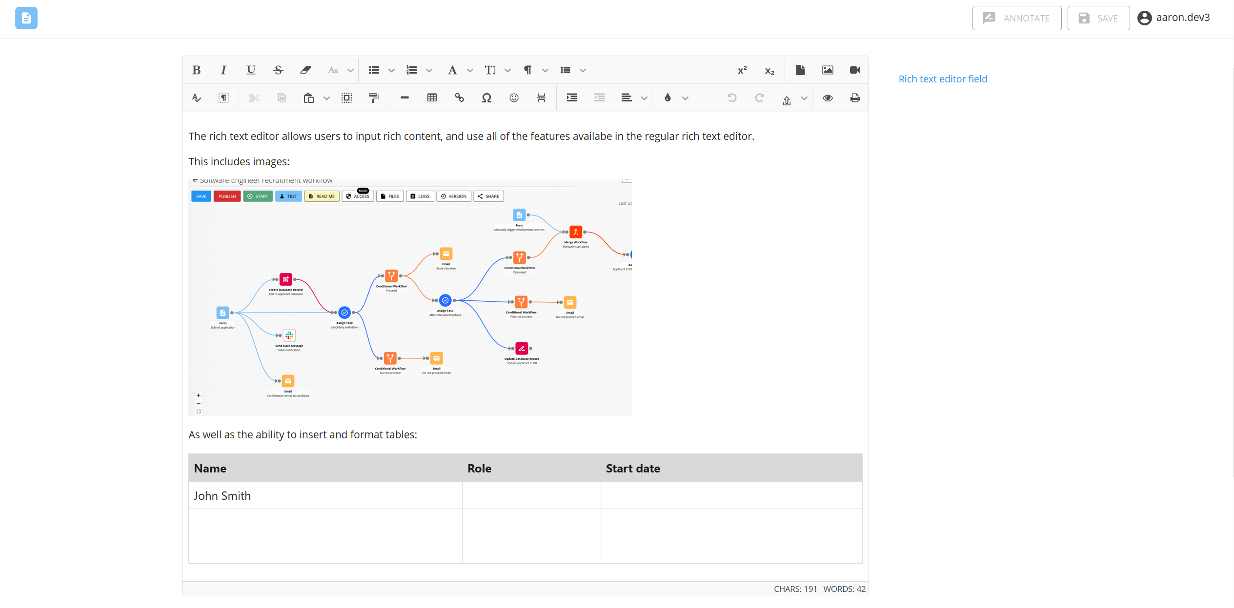
Rich Text Editor
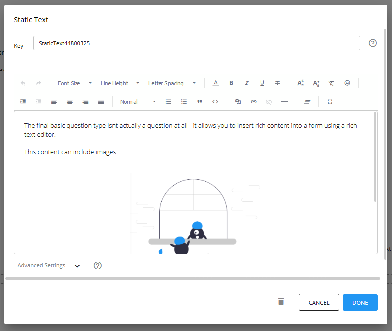
This field exposes a rich text editor inside of the form or task, much like the editor used in the Email component and Document Editor component. This rich text editor comes with a wide range of rich text features, and allows users to enter in more complex content which can include a text, images, tables with a variety of styling options as well.
Output of the rich text editor field is in HTML
The output of the rich text editor field is in HTML format. This allows it to be inserted into HTML compatible components such as the body of the email component, content blocks inside of other forms or tasks, and the document editor. It also means you can print HTML content inside of it, such as the e-signature image generated by the e-signature field
However, this also means that if you pass it into a component that is not designed to handle HTML, it will print with all the HTML tags.
Character limit
The rich text editor field has a limit of 2147483647 characters. This includes characters from any images inserted and then converted into Base64 as well as any html tags used to format and style the content.
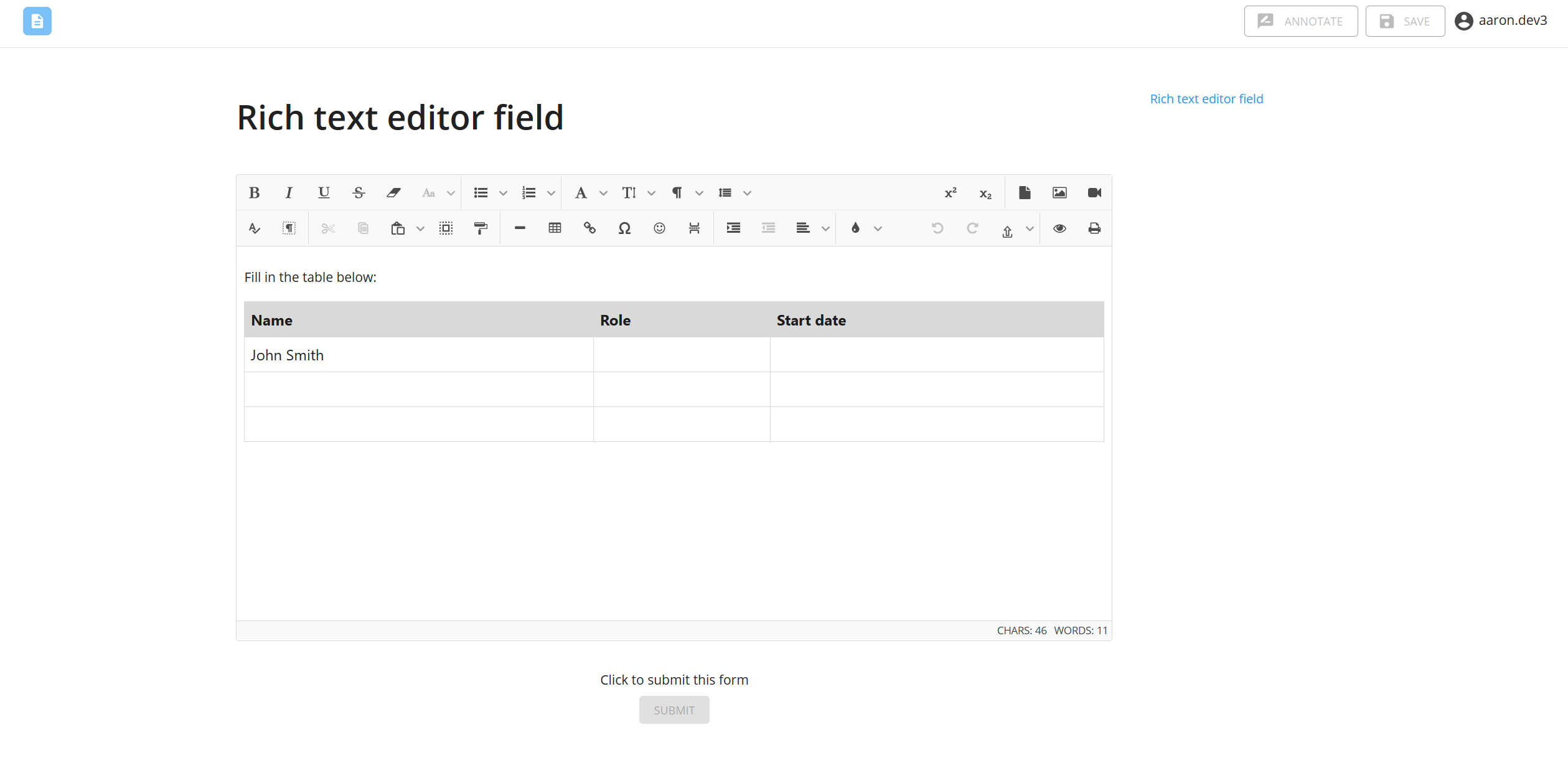
Pre-set content inside of the editor
Anything you type into the rich text editor in the settings will be rendered when viewed inside of the form or task by the user.
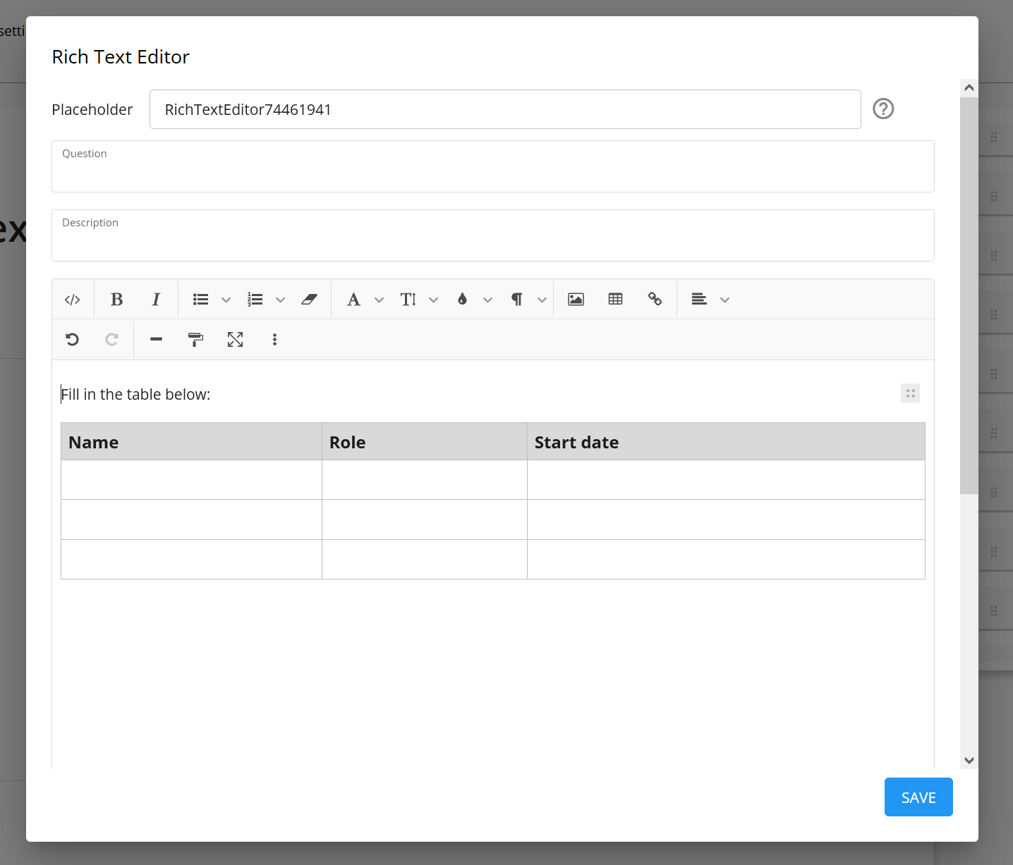
You can use this to set a template or other formatting requirements you want the user to follow, or simply insert instructions.
Number Input
The number input question captures numerical data only. Use this when you need the user to only enter numbers and nothing else.

Content Block
The content block component allows you to insert rich text content with images, hyperlinks and other formatting via the rich text editor.
E-signature
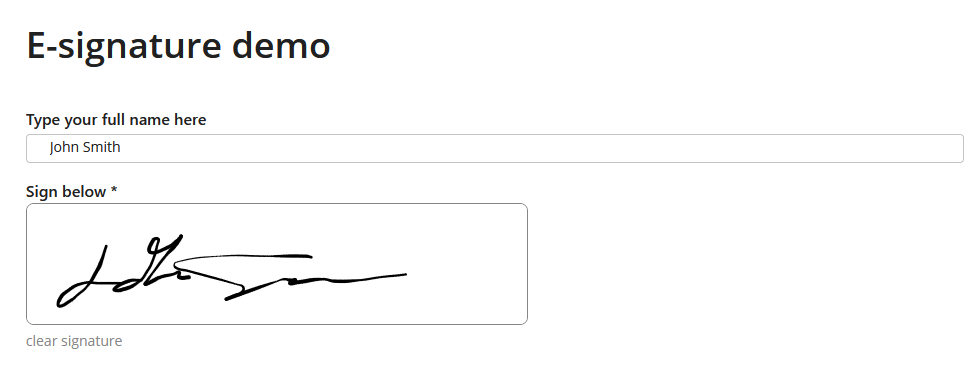
The e-signature module allows you to collect signatures from users as part of a form or a task. It works by providing a drawable block where users can draw in a signature. This signature is then printed as an image when the form or task is submitted. This image is stored in your file library, and can be directly inserted into documents or the URL to it referenced.
File preview
The file preview allows you to pass in a link to file and will then display that file in a preview window that users of a form can view.
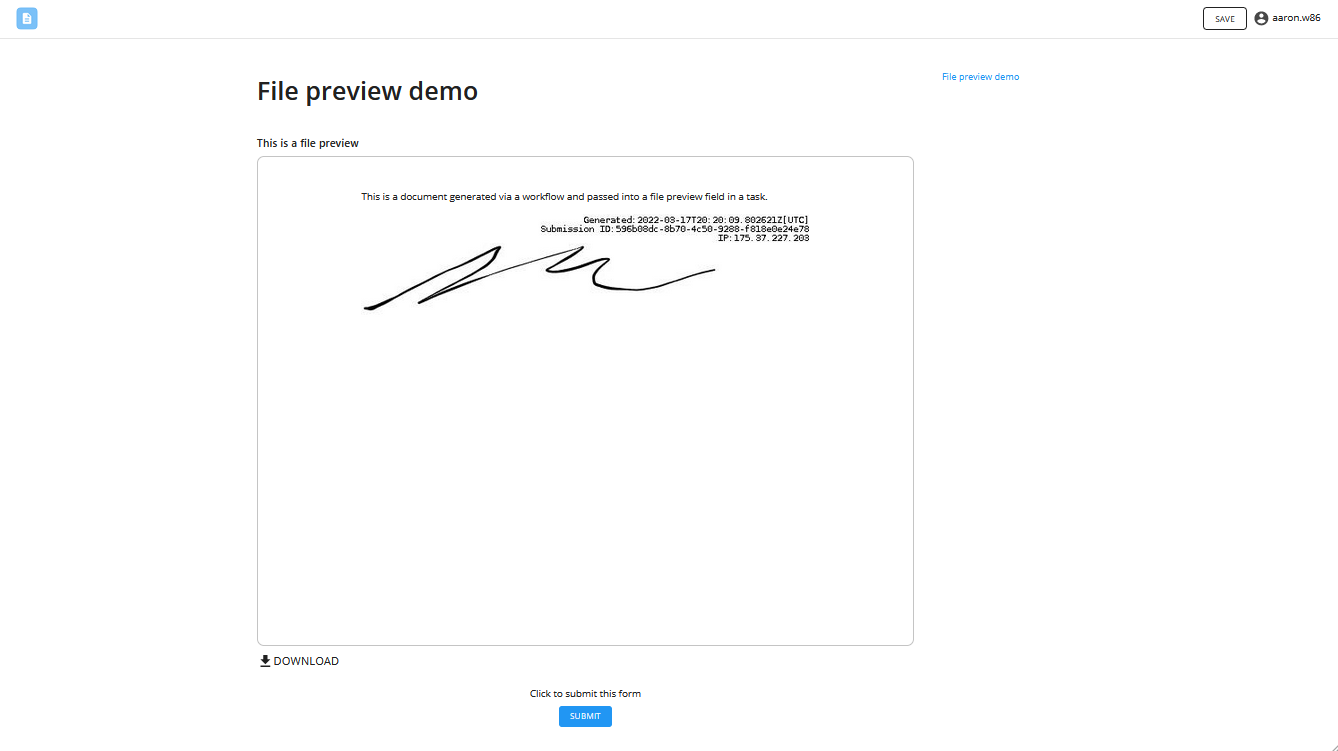
You must select the correct file type for this field to work properly. If file passed into the field does not match the file type selected, the preview will not render e.g. pass a .pdf document when you selected .docx as the file type.
In the Assign Task, you can pass in a placeholder that is a URL to a file.

Radio Button
The radio button question allows users to select one option from the list of answers.

When setting up a this question, take note of the difference between the answer choice and the answer choice. The answer choice is what is displayed to the user, and the answer value is what is exported to the workflow. Click here for more details.
Dropdown
The dropdown question allows users to select a single option from a dropdown list. The dropdown list is also searchable, meaning it works well for questions where the list of answers can be very long.

When setting up a this question, take note of the difference between the answer choice and the answer choice. The answer choice is what is displayed to the user, and the answer value is what is exported to the workflow. Click here for more details.
Checkbox
The checkbox component allows users to select multiple options from the list of answers. The output of the checkbox question is a list of all the options selected e.g. [Option A, Option B]

When setting up a this question, take note of the difference between the answer choice and the answer choice. The answer choice is what is displayed to the user, and the answer value is what is exported to the workflow. Click here for more details.
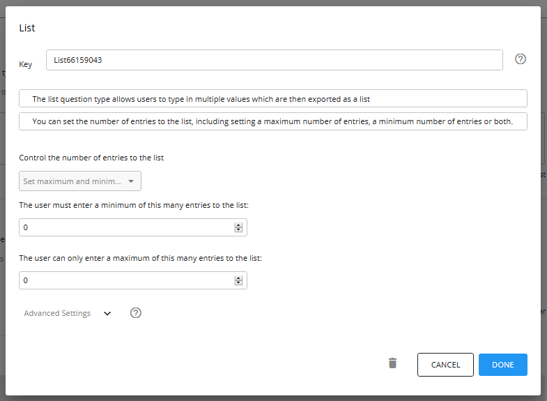
List
The list question type allows users to type in multiple values which are then exported as a list. In the example below, the output would be [John, James, Jane, Adam]

You can set the number of entries to the list, including setting a maximum number of entries, a minimum number of entries or both.
The output of this field will be printed with the square brackets at the start and end of the list i.e. "[this, is, a list]". To remove these square brackets, you can pass it through a "Convert List to Text" in the List Transform component
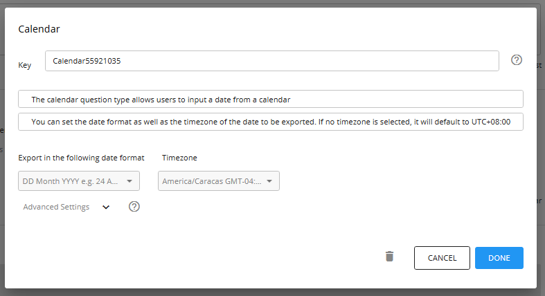
Calendar
The calendar question type allows users to input a date from a calendar.
You can set the number of entries to the list, including setting a maximum number of entries, a minimum number of entries or both.

The output of the calendar question can be either date only or date and time. If you select a date format without a time, then the calendar question will only allow users to select a date. If you select a date format with a time, the user will be able to select a date and then select a time as well.
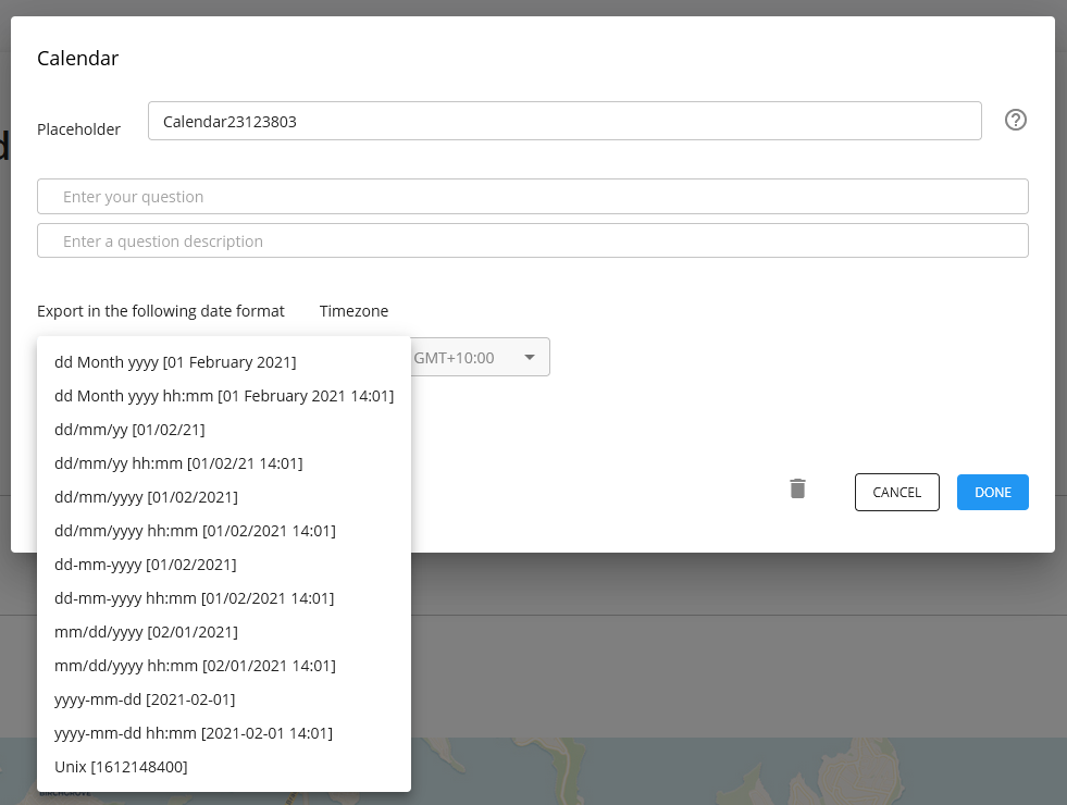
You can set the date format as well as the timezone of the date to be exported. If no timezone is selected, it will default to UTC+08:00
Repeatable section
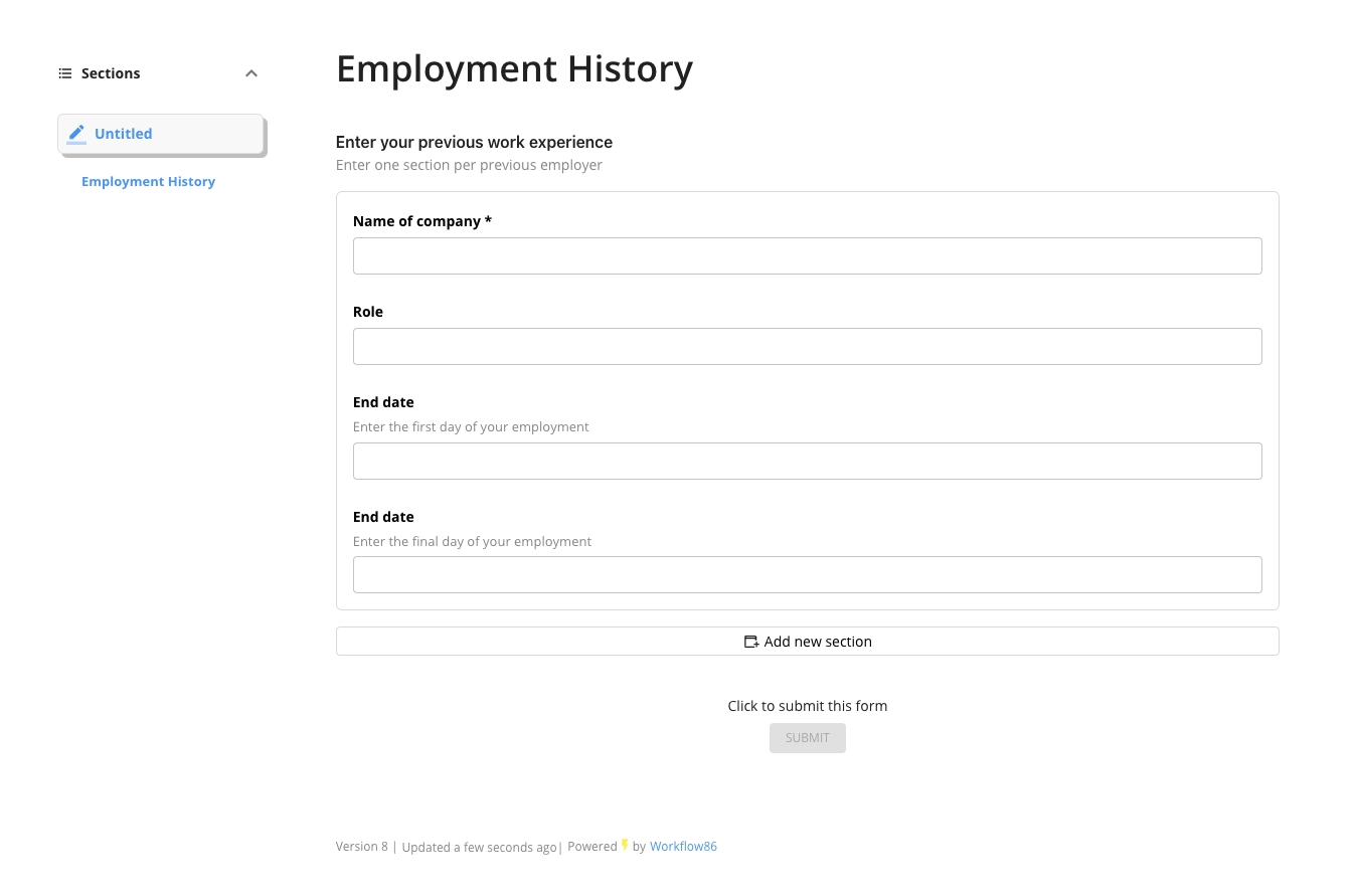
A repeatable section allows you to collect multiple questions grouped together into sections, with the user able to add multiple sections in their response as required.
The repeatable section is useful for collecting information that may have an variable number of entries. For example, a question where the user is asked to provide the details of each of their past epmployers, which will vary from user to user.
Configuring a question in a section
A repeatable section can have the following question types:
- Short text - single line text input
- Long text - multi-line text area
- Rich text - formatted text editor with styling options
- Number - numeric input
- Dropdown - select from a list of options
- Radio button - single choice selection
- Checkbox - multiple choice selection
- Datetime - date and time picker
- List - add multiple text items as tags/chips
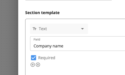
Each section has a key, question and description field.
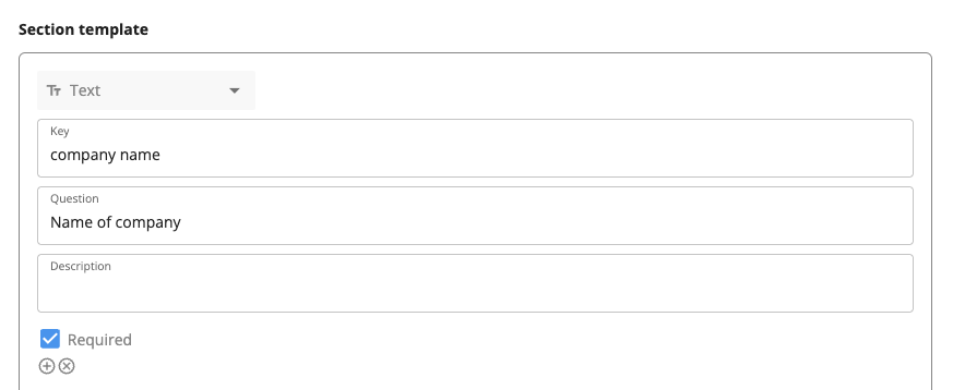
The "Key" field sets the key value for a question in the output. For example, if the key is "company_name", then then "company_name" would be the key in the key value pair.
The "Question" and "Description" fields are displayed in the form to the user. They are not included in output.
Question fields inside of a section can be set to required by checking this checbox.
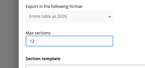
A repeatable section must have a maximum number of sections set which must be greater than or equal to 1 i.e. at least one section must be displayed.
Question fields can also make use of internal and external placeholders.
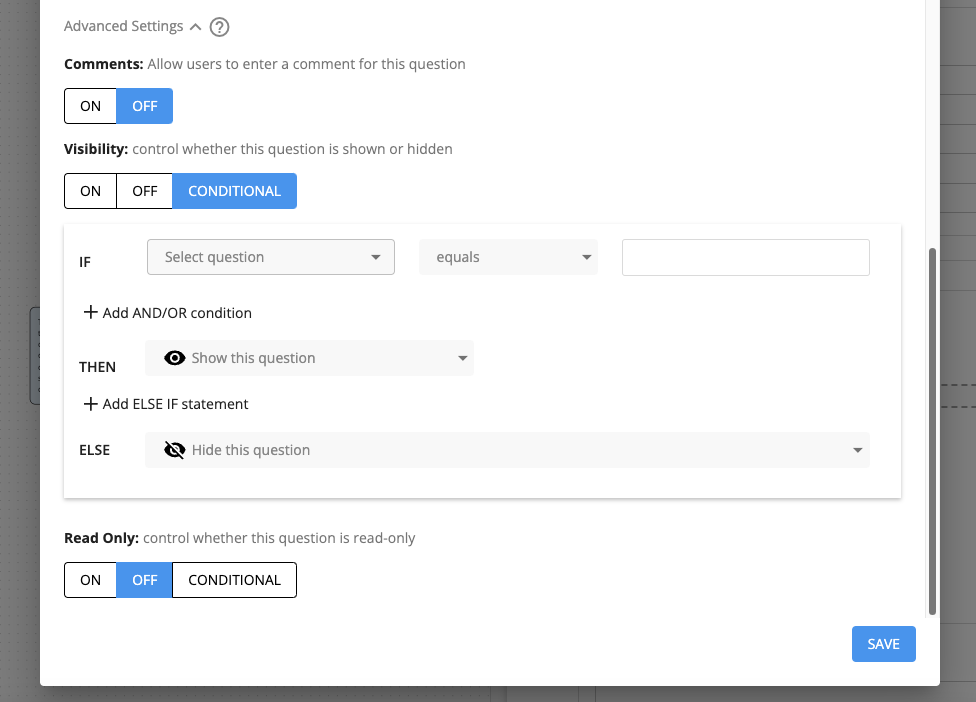
You can apply comments, control visibility and the read-only status of the entire repeatable section.
Repeatable section JSON output
The output of the repeatable section is a single JSON string. The JSON is an array (or list) with each section returned as an object, and each field within that section as a key and value pair.
The key of the key value pair is set by the "Key" value of each question in the section. The value is set by the answer entered by the user for that question.
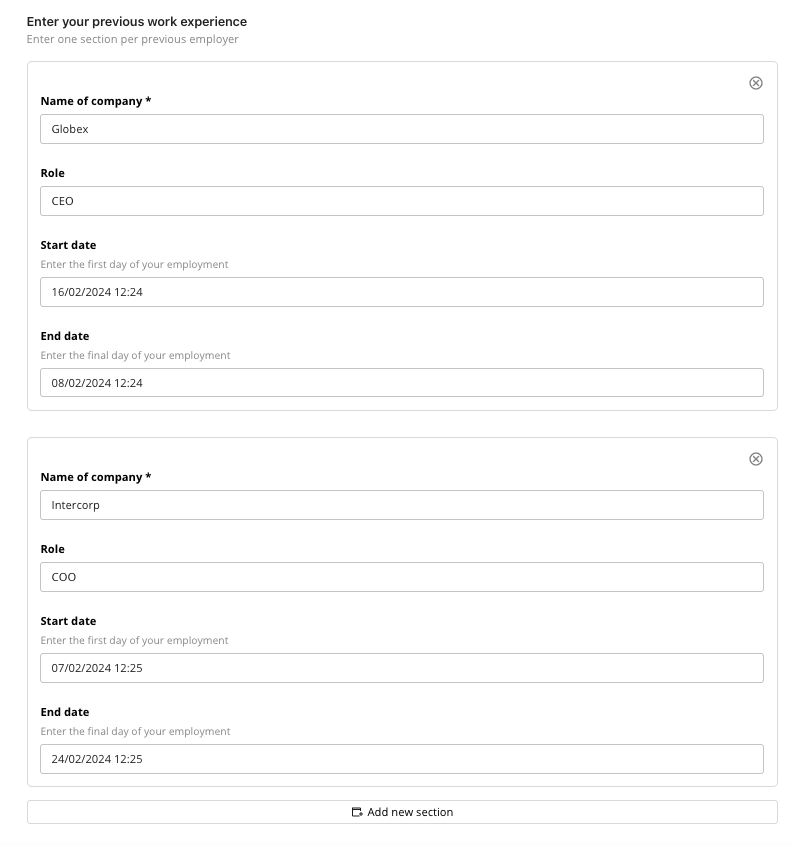
Repeatable section output
In the example below, 2 sections with fields "Name of company", "Role", "Start date" and "End date" have been filled:
The output of this on submission will be this JSON string:
[
    {
        "company_name": "Globex",
        "role": "CEO",
        "start_date": "2024-08-02T07:15",
        "end_date": "2024-08-02T06:22"
    },
    {
        "company_name": "Intercorp",
        "role": "COO",
        "start_date": "2024-08-02T06:25",
        "end_date": "2024-08-02T06:22"
    }
]
[
{
"company_name": "Globex",
"role": "CEO",
"start_date": "2024-08-02T07:15",
"end_date": "2024-08-02T06:22"
},
{
"company_name": "Intercorp",
"role": "COO",
"start_date": "2024-08-02T06:25",
"end_date": "2024-08-02T06:22"
}
]
If a section is partially filled with answers to at least one field but not others, the fields not filled in will be returned as null values. If a section is completely empty with no fields filled out, that section will not be returned in the output.
Output formats by field type
Different field types return values in different formats:
| Field Type | Output Format | Example |
|---|---|---|
| Short text | String | "John Smith" |
| Long text | String | "This is a multi-line\ntext response" |
| Rich text | HTML string | "<p>Formatted <strong>text</strong></p>" |
| Number | Number | 42 |
| Dropdown | String (selected value) | "Option A" |
| Radio button | String (selected value) | "Yes" |
| Checkbox | Comma-separated string | "Option 1, Option 2, Option 3" |
| Datetime | ISO8601 string | "2024-03-17T10:00:00+10:00" |
| List | JSON array string | "[\"Item 1\",\"Item 2\",\"Item 3\"]" |
All datetime values from a repeatable section will be formatted in ISO8601 e.g. "2024-03-17T10:00:00+10:00".
How can I use the JSON output of a repeatable section in a workflow?
Typically you will want to combine the repeatable sections with another component to process or parse the values of the output. The two key components here would be the Run code component which can be used to perform custom and more complex data transformations, and the Run concurrent threads component (also known as Loop through list) which can split each answer from the repeatable section into its own thread.
You cannot directly feed the output of the repeatable section into the Parse JSON as that component can only parse JSON objects and not JSON arrays.
Table
The table question type allows you to create a table or grid to collect multiple rows of information and data. You can specify the columns of data you want to collect, and choose the field type for that column.
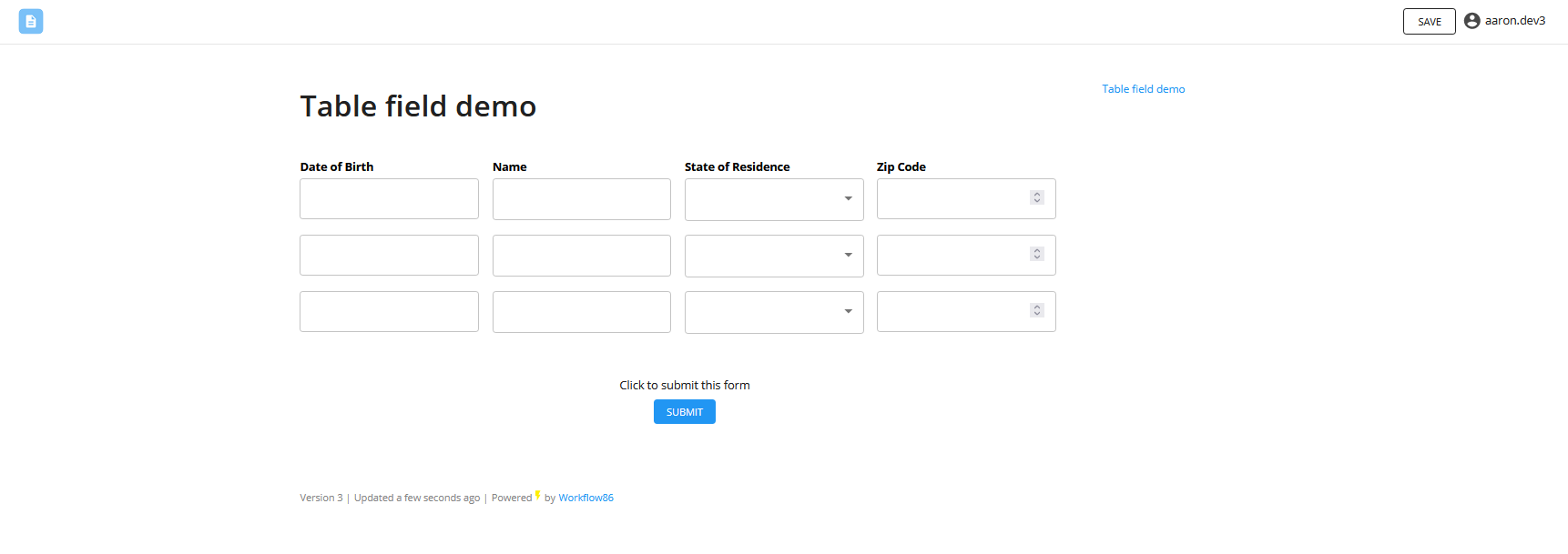
Columns in a table can be:
- a text field
- a datetime field
- a dropdown field
- a number field
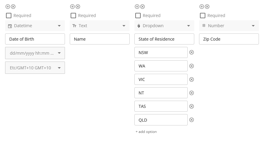
Selecting the output format
When setting up a table, you will need to specify how you want the table to be rendered into placeholders. The output of a table can be displayed in two modes: by column or by row.

Export each row as a placeholder
The first mode is to export each row of the table as a list placeholder. The number of placeholders will depend on the number of rows in the table. So using the filled out table below, this mode would result in three placeholders:
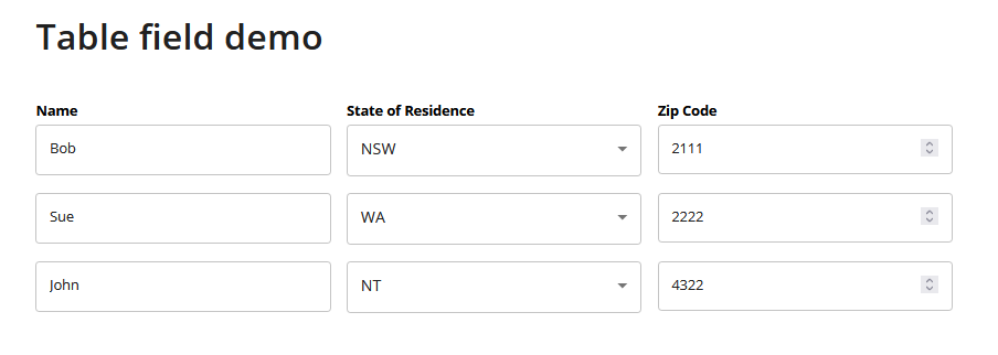
- table.answer.row0 = [Bob, NSW, 2111]
- table.answer.row1 = [Sue, WA, 2222]
- table.answer.row2 = [John, NT, 4322]
Export each column as a placeholder
The second mode is to export each column of the table as a list placeholder. The number of placeholders in this case will depend on the number of columns in the table. So using the filled out table below, this mode would result in three placeholders:
- table.answer.name = [Bob, Sue, John, ]
- table.answer.state_of_resident = [211, 2222, 4322]
- table.answer.zip_code = [NSW, WA, NT]
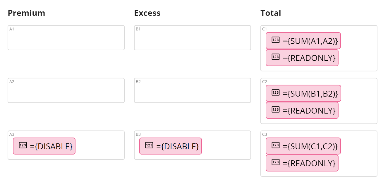
Perform calculations using table cells
You can set a cell to perform calculations which reference other cells in the table (like in Excel). To do this, wrap the calculation with a "={" at the start and a "}" at the end.
For example, if you want to perform a SUM(A1, A2), then you would type in ={SUM(A1, A2)} into the cell.
What functions can I perform?
Click here to see a full list of functions that can be used in a cell calculation.
Functions cannot be nested at this stage. For example, you cannot do a SUM of SUM functions such as SUM(SUM(1,2), SUM(3,4))
Basic operators
You can also use the following operators to perform calculations between cells and numbers as well:
- “+” to sum e.g. ={A1+A2}
- “-” to subtract e.g. ={A1-A2}
- “*” to multiply e.g. ={A1*A2}
- “/” to divide e.g. ={A1/A2}
- “^” to power e.g. ={A1^2}
Set cells to be required
To set a cell to be required, type in ={REQUIRED} into that cell.
Set cells to be read only
Setting a cell to read only means that the cell cannot be edited by the user. You may want to make a cell read only if it is a calculation cell that you do not want the user to be able to override or change.
To set a cell to read only, type in ={READONLY} into the cell.
Disable cells
Disabling a cell removes that cell from table. To disable a cell, type in ={DISABLE} into that cell.
A disabled cell outputs an empty value. If you have a row with 4 cells, but the first 3 are disabled, the output will be [, , ,value]
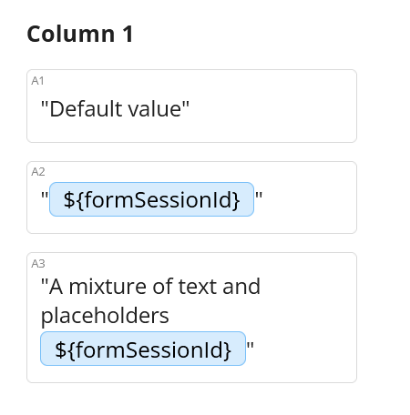
Setting a default value for a cell
You can set a default or pre-filled value for a cell by placing double quotation marks around that value. For example, if you want the default value for a cell to be "Sydney" then type in "Sydney" (with the quotation marks) into that cell.
You can also use placeholders when setting default values by placing double quotation marks around that placeholder e.g. "${placeholder}" and "Your name is ${name.answer}".
Upload file
The upload file question allows users to upload files, which are stored inside of the File Library for the workflow containing the form or task.
Multiple files can be uploaded into one upload file field. When multiple files are uploaded, they are stored individually with their own URL.
The maximum size for each individual file uploaded is 30MB.
The uploaded file will be stored in the File Library and the placeholder will be a list or URL(s) to download those uploaded files e.g. [https://file.workflow86.com/file/get/123213, https://file.workflow86.com/file/get/adsadsadsada].

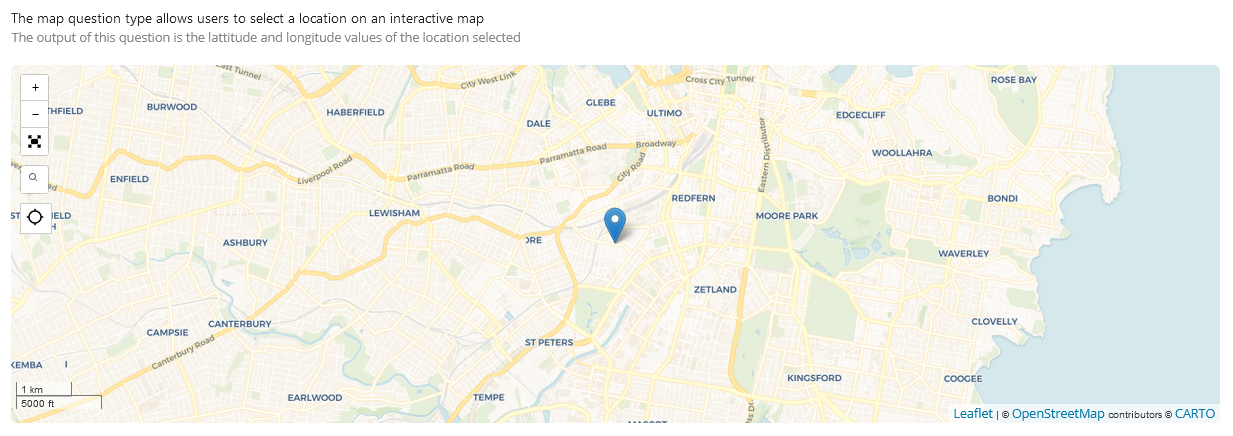
Map
The map question type allows users to select a location on an interactive map. The output of this question is the latitude and longitude values of the location selected